
April '25
Monthly design roundup for April 2025.

Hi everyone! Welcome back to the newsletter. Hope you’re all doing well and definitely not experiencing burnout right now like the person who is currently writing this……. if you are that’s okay, we’re in this together. The weather is getting warmer in NYC, we just had a beautiful spring thunderstorm yesterday. But with spring comes an ungodly amount of allergy medication. Anyway, let’s talk about some art!
DESIGN
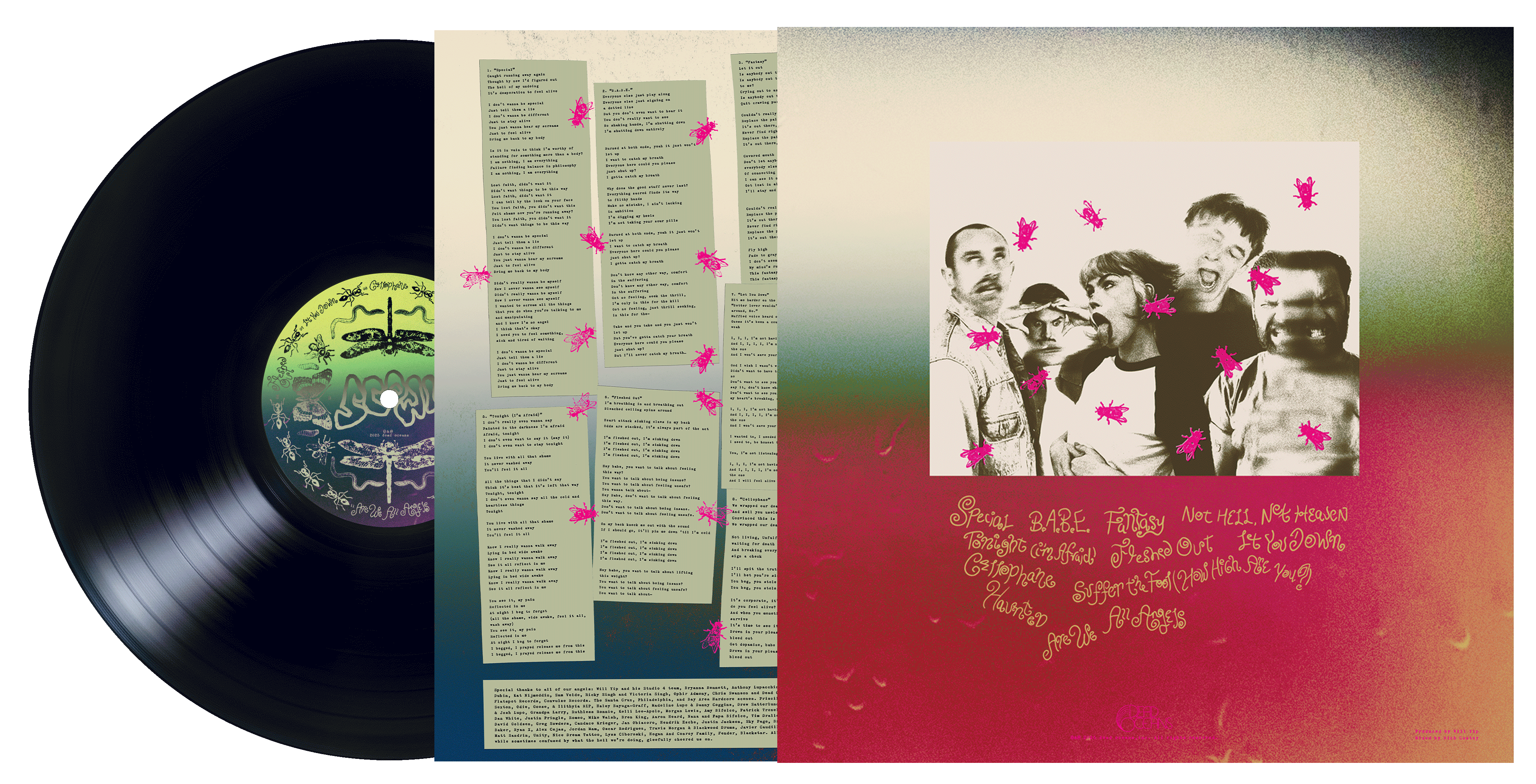
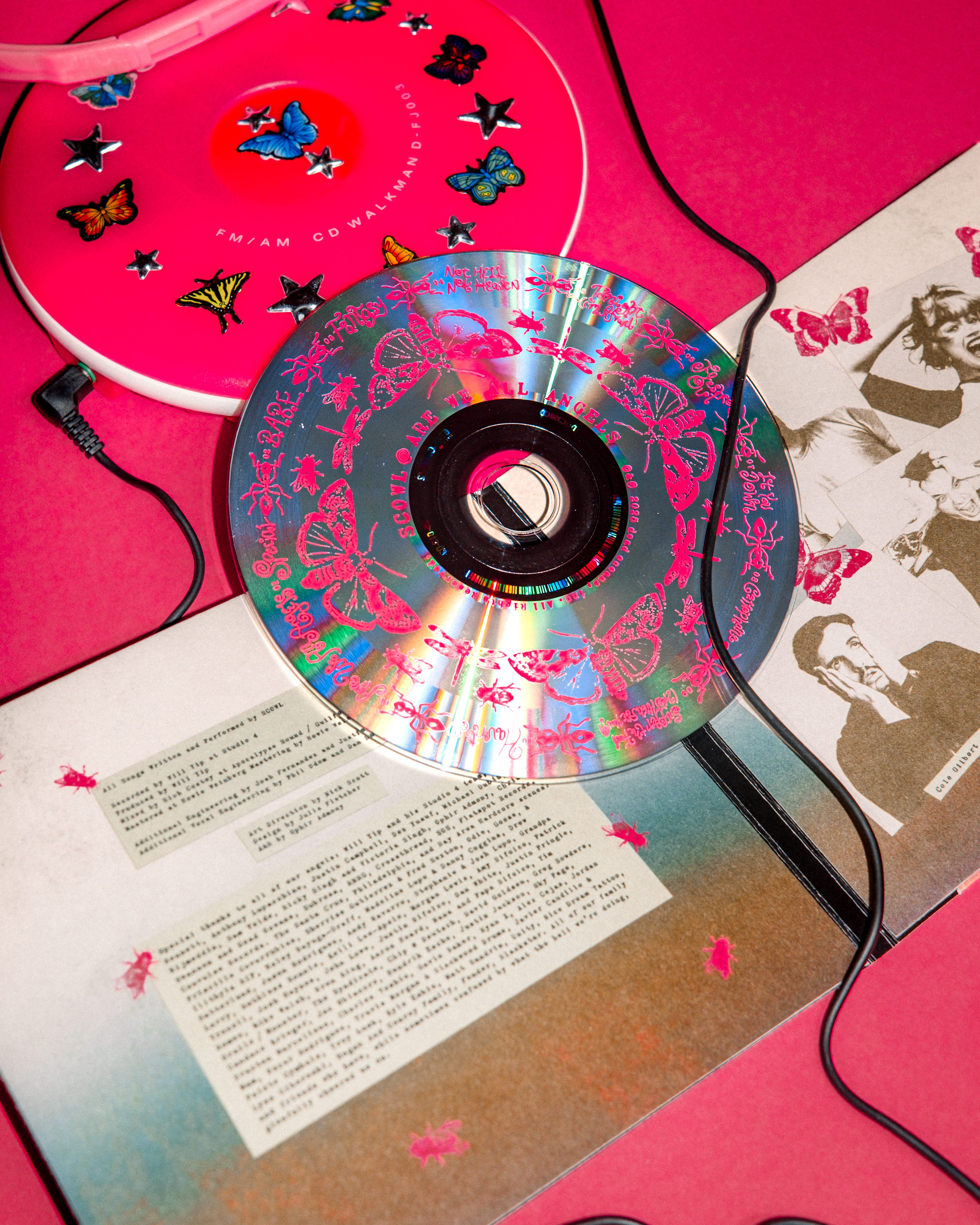
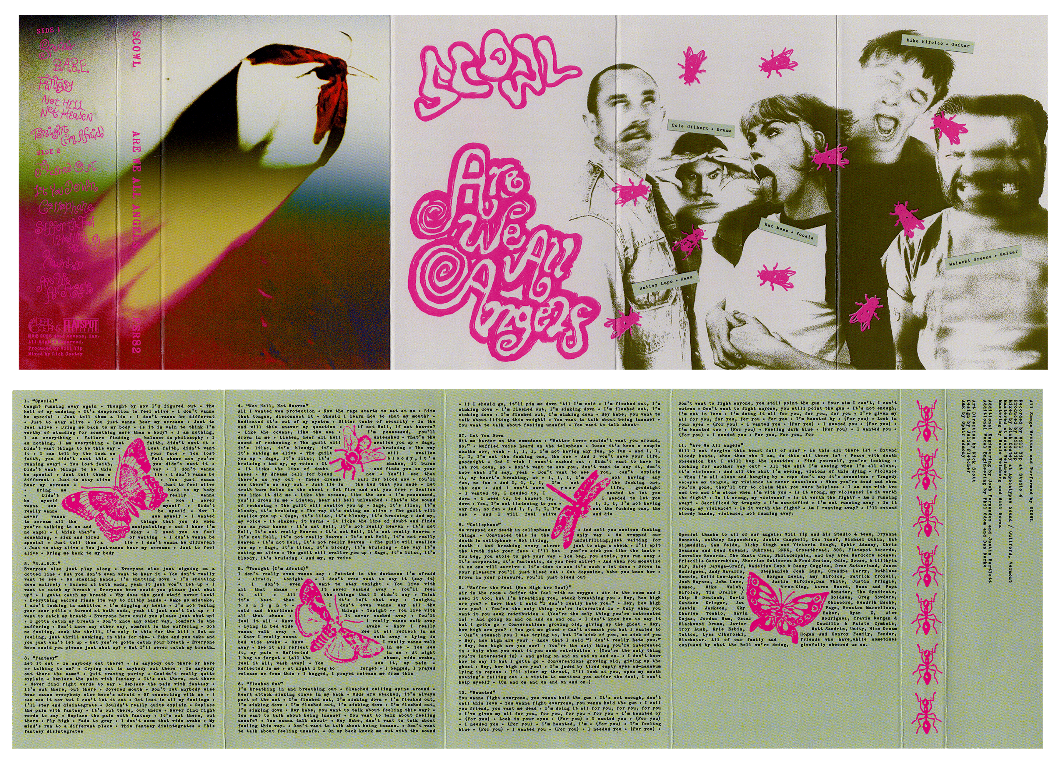
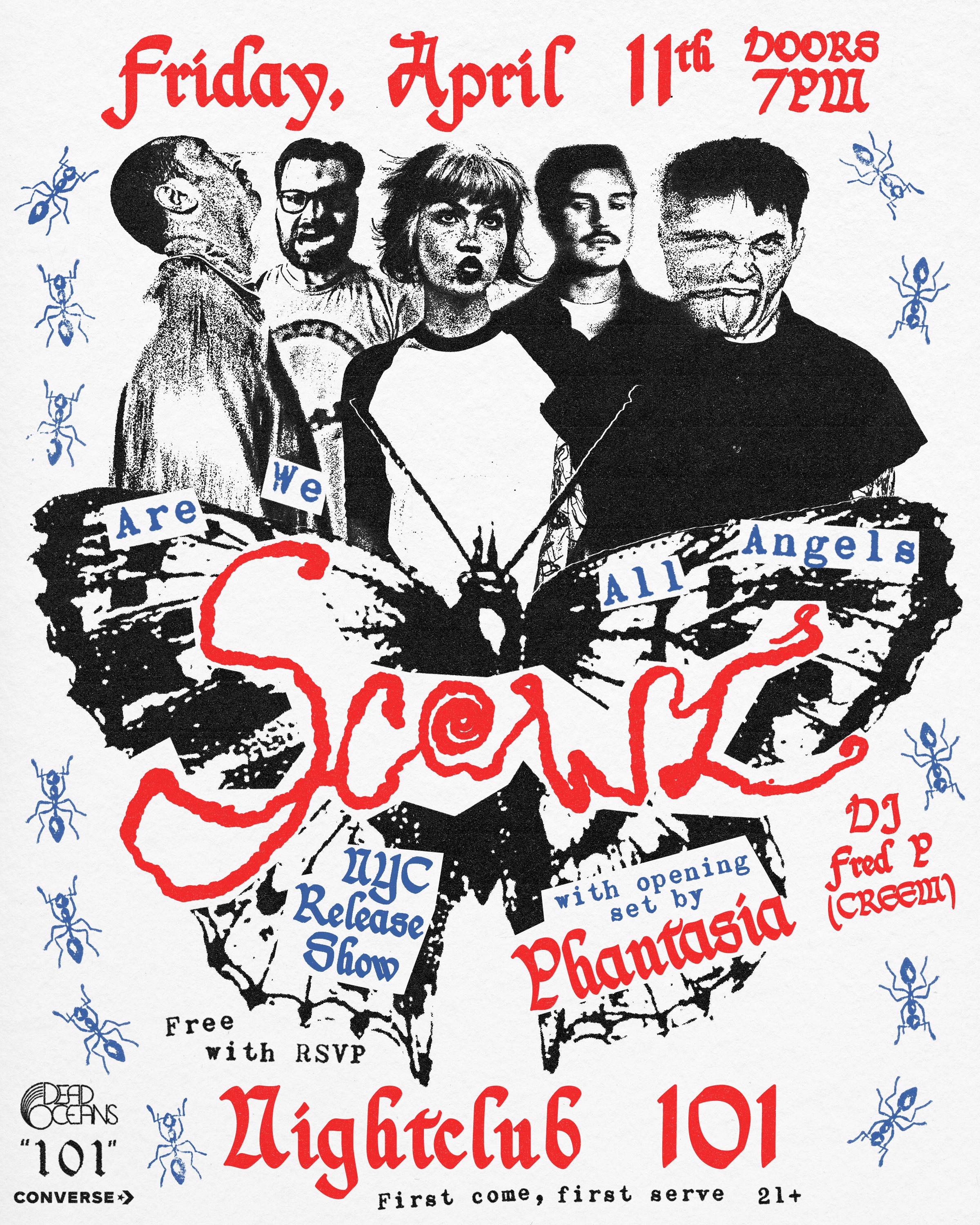
So excited I finally get to share the packaging design & visual identity for Scowl’s new album Are We All Angels, designed by me & my coworker/art director Nick Scott at Dead Oceans. Nick and I spent over 7 months crafting this visual identity; hand stamping, hand writing, and hand making so many elements of this record that eventually built an entire world unique to the band, carrying itself throughout the album campaign. Where we landed visually ended up being (in my opinion) a great representation of the album’s sound— technicolor and lush with a gritty edge.
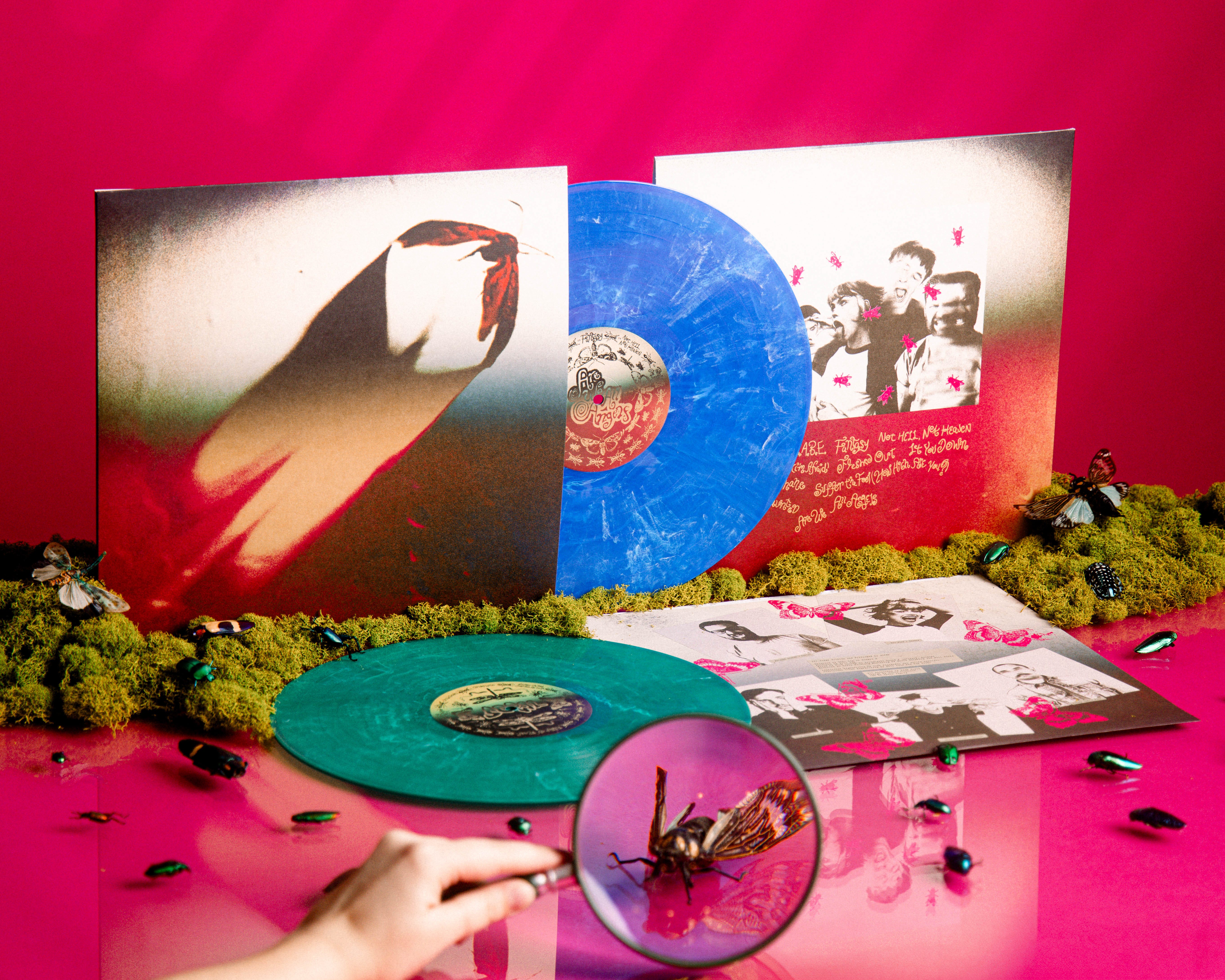
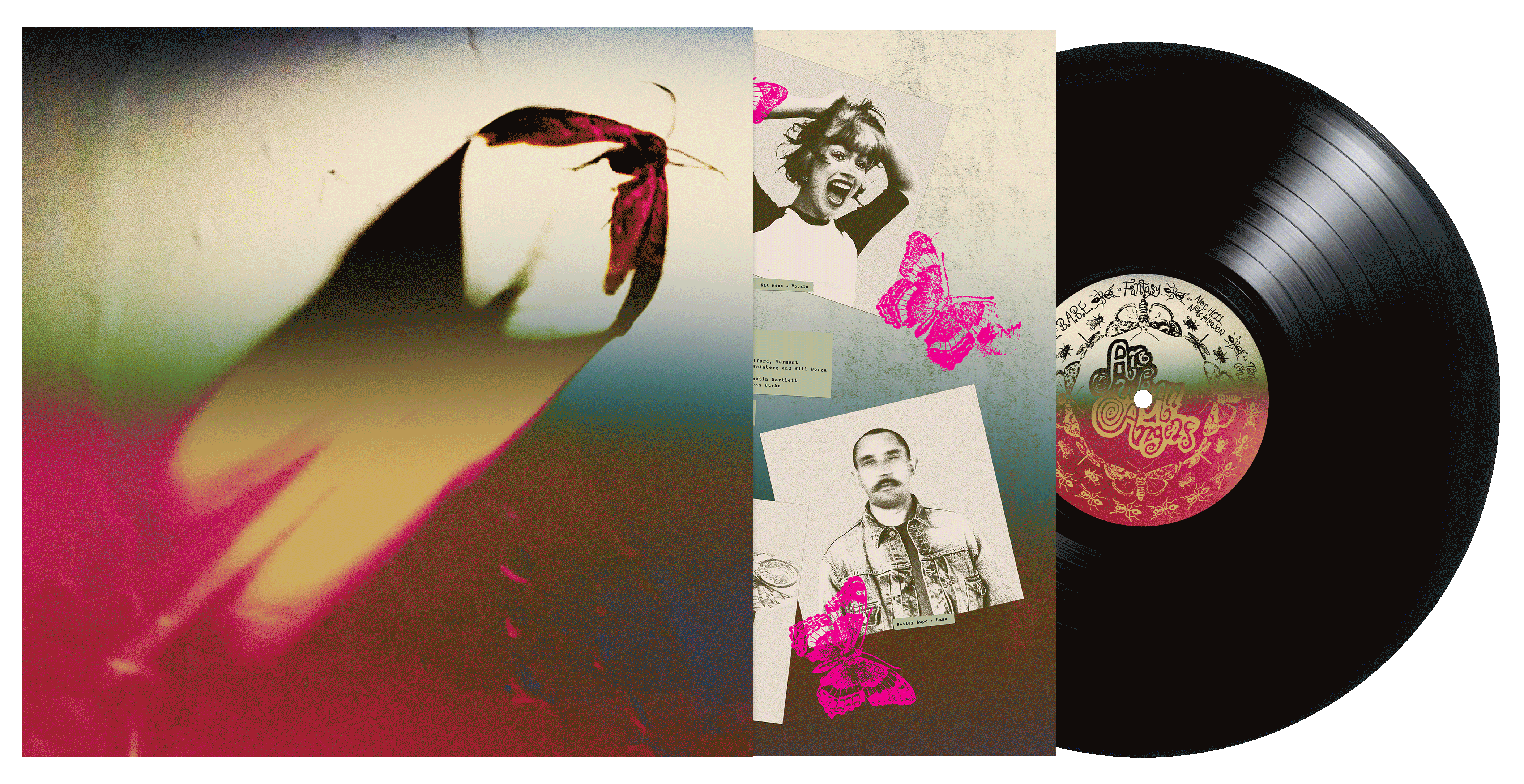
The album cover ended up being this beautiful, ethereal moth that visited Nick one night not too long after discussing moth imagery with the band for the cover. He ended up photographing it and applying this incredible color treatment, which influenced the rest of the packaging.
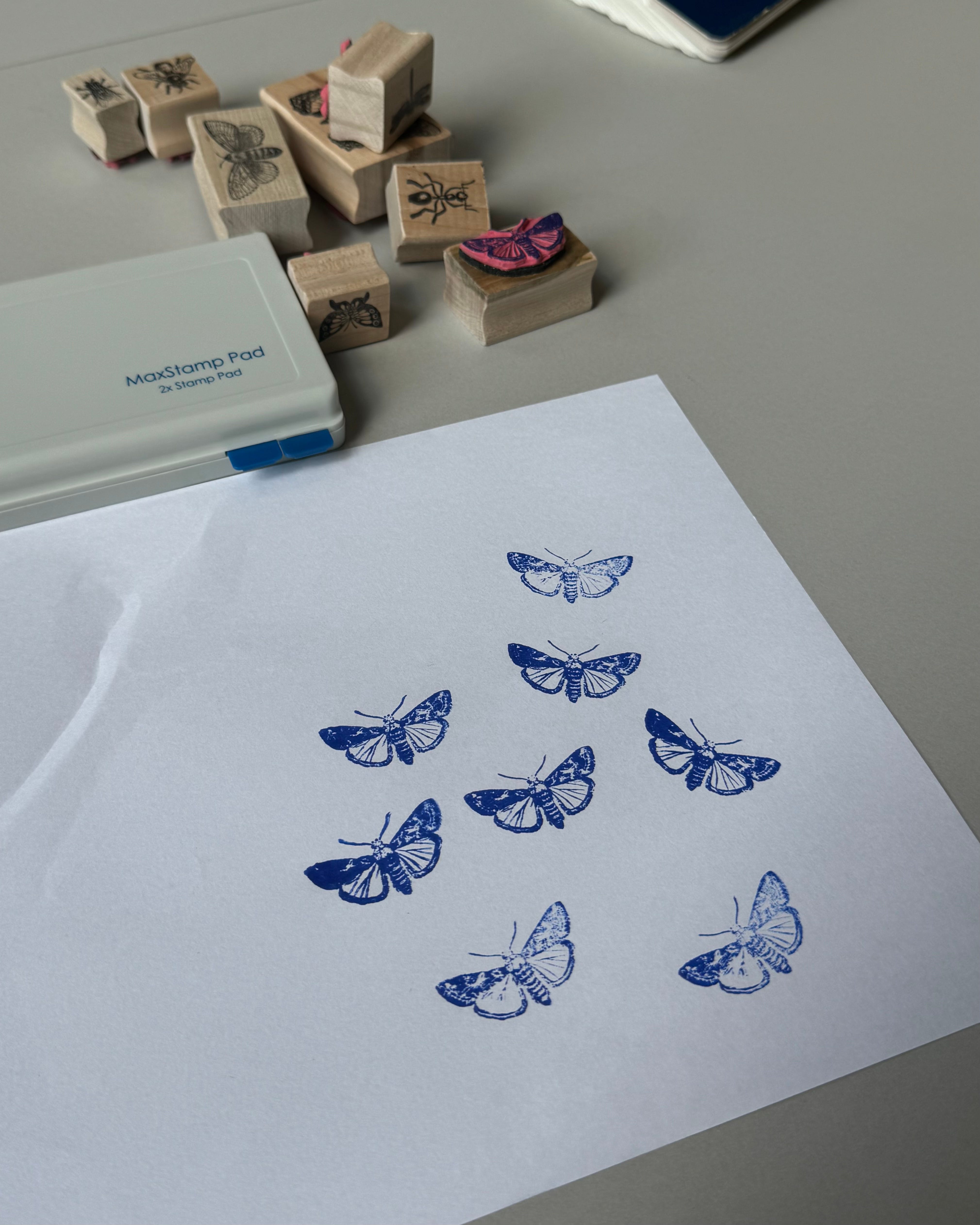
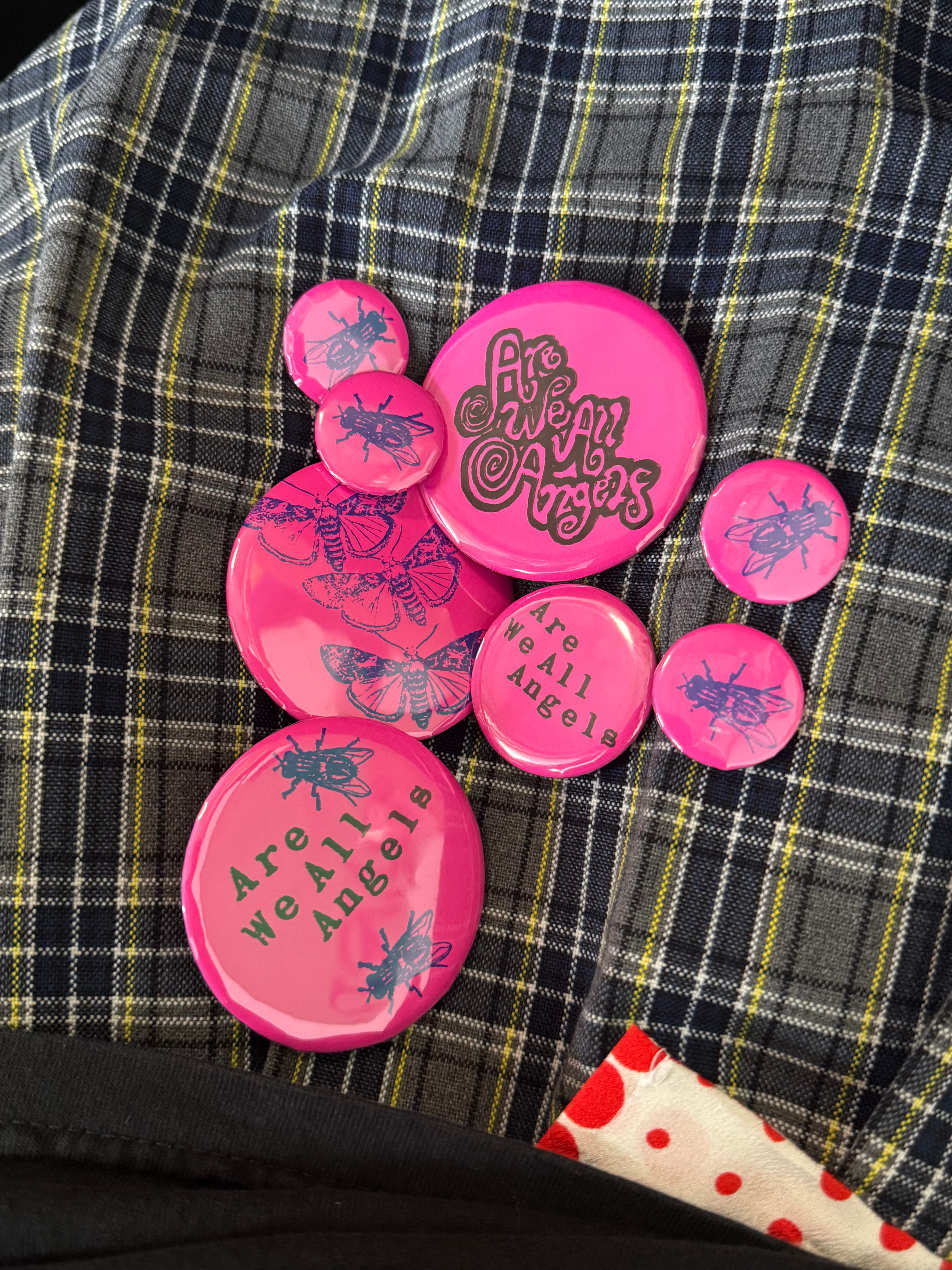
The center labels were the very first thing I created for this record. Which sounds like working backwards, but sometimes it’s strangely the easiest entry point for me. Unfortunately for me I am a bottom up thinker, I need to put together small parts and details before I can understand how it works together as a whole. It’s simply too overwhelming, and I just find it easier to break up the creative process in the most accessible way possible. I had a very clear vision of laying out the bug stamps in kaleidoscopic patterns, almost like specimen laid out under a microscope, framing the text on each label. The bugs then started to inform the rest of the artwork and photography.


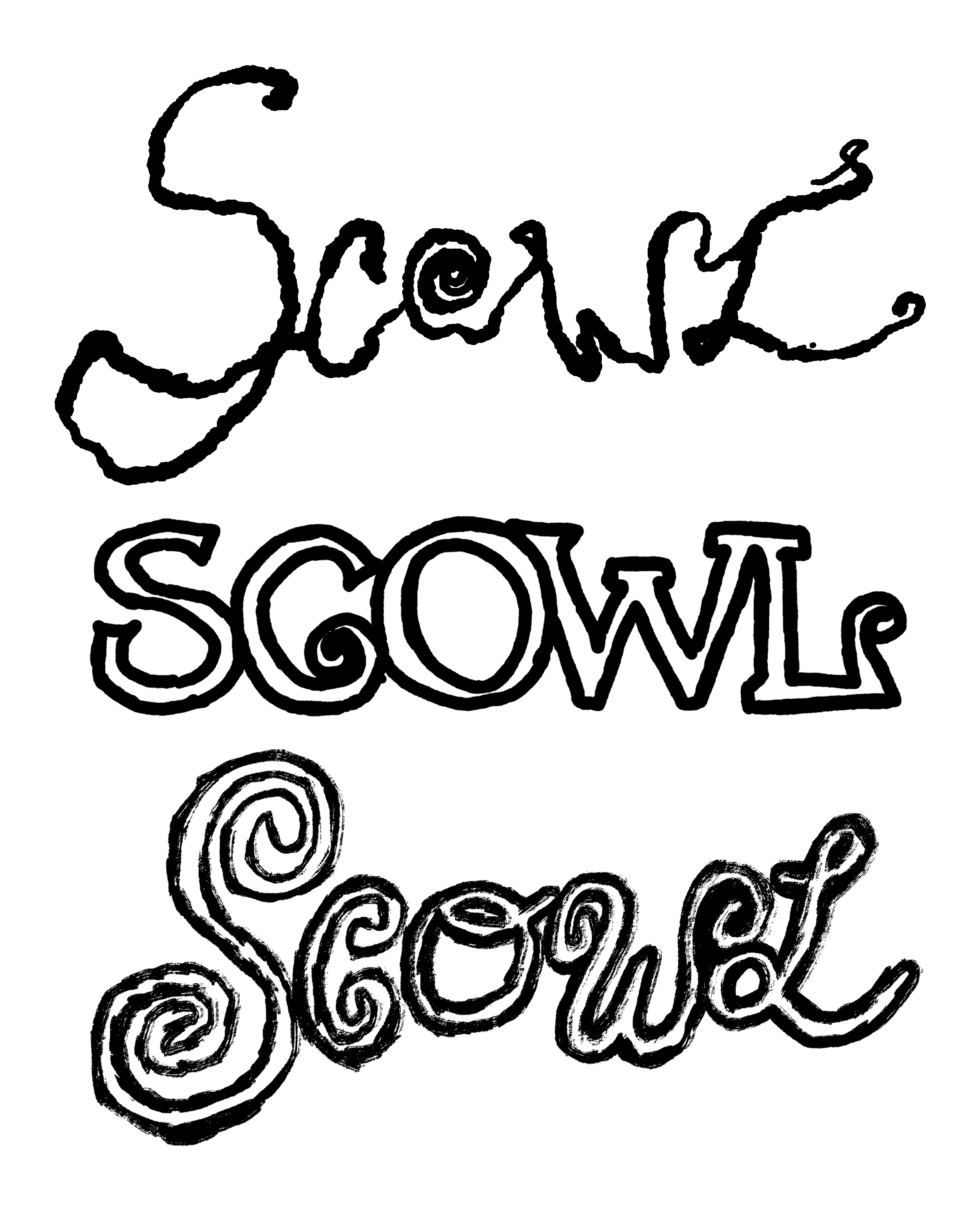
Bugs are a reoccurring motif throughout the vinyl, CD, and cassette packaging, and they all came from stamps I bought from a stamp store. I wanted to be able to create variety in each bug, with subtle differences in ink density and texture— something you can do digitally but I thought physical stamping would be closer to the look I wanted to achieve. There was also a ton of hand lettering exploration for this packaging too, something that isn’t typical for me but ended up being a great muscle to stretch. The end result was a combination of messy and swirly letterforms and logos, which also became a defining characteristic for the look of the record. Everything was handwritten, with the typewriter font for the lyrics and credits being secondary. I really love how the album title lockup ended up, I found a screenshot on my iPad the day I drew it so I definitely have to share that with you all.


The inner sleeves also feature printed, cut, and scanned lyrics on one side, with portraits of the band members on the other. These portraits became central to the marketing surrounding this album, with the main photograph seen on the back of the record. The band each individually took self portraits at home, which Nick then distorted and created a photo treatment for.
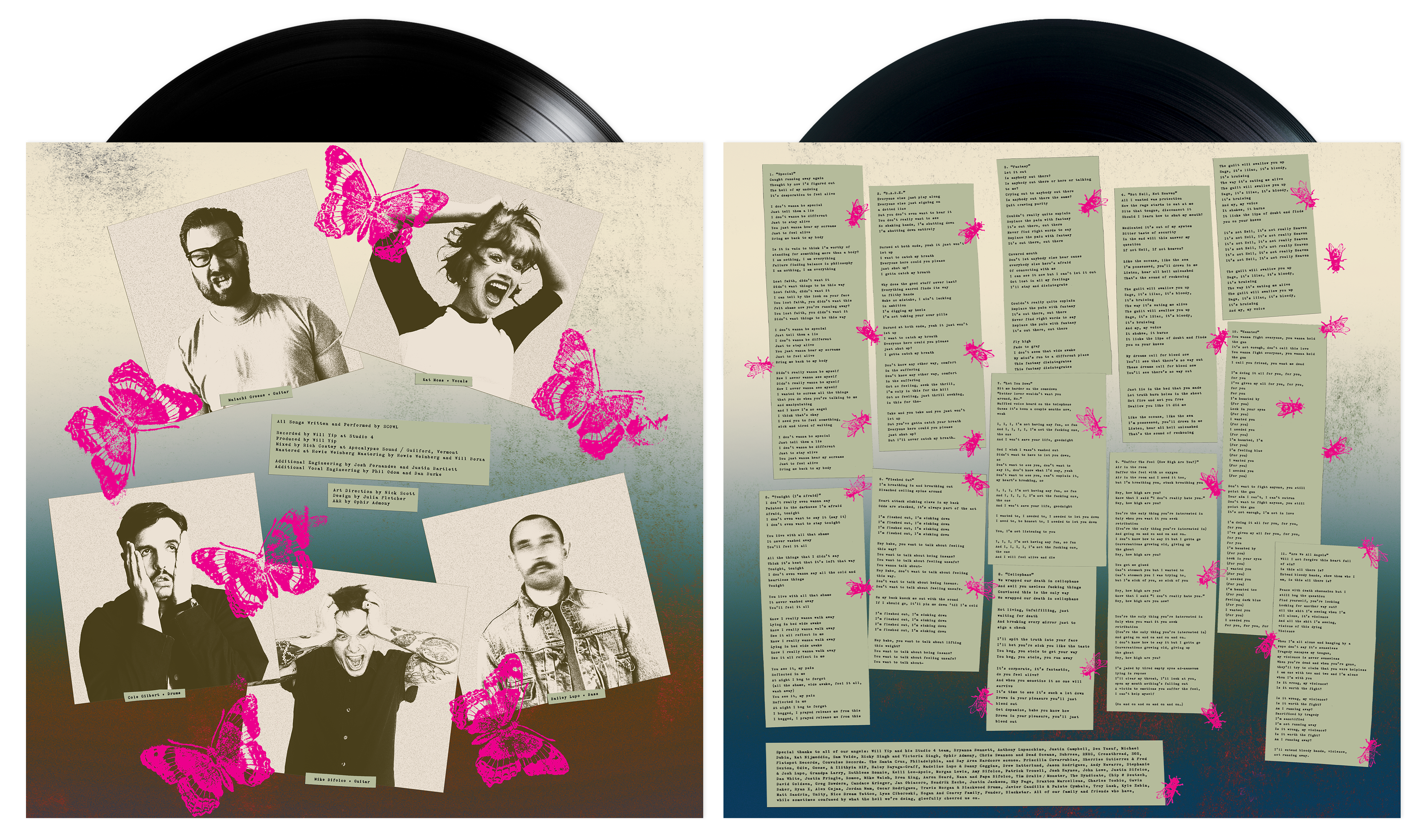
I love how the CD disc turned out too, instead of just printing the bugs on a solid color label I thought it would be much prettier to print it directly on the disc, to have the reflective surface of the CD mimic the rainbow you see on the cover art.
The cassette packaging ended up having a 6 panel J-Card featuring lyrics with bugs overlaid throughout, as well as two cassette shell colorways, clear and green.


Video below by Jarett Loeffler
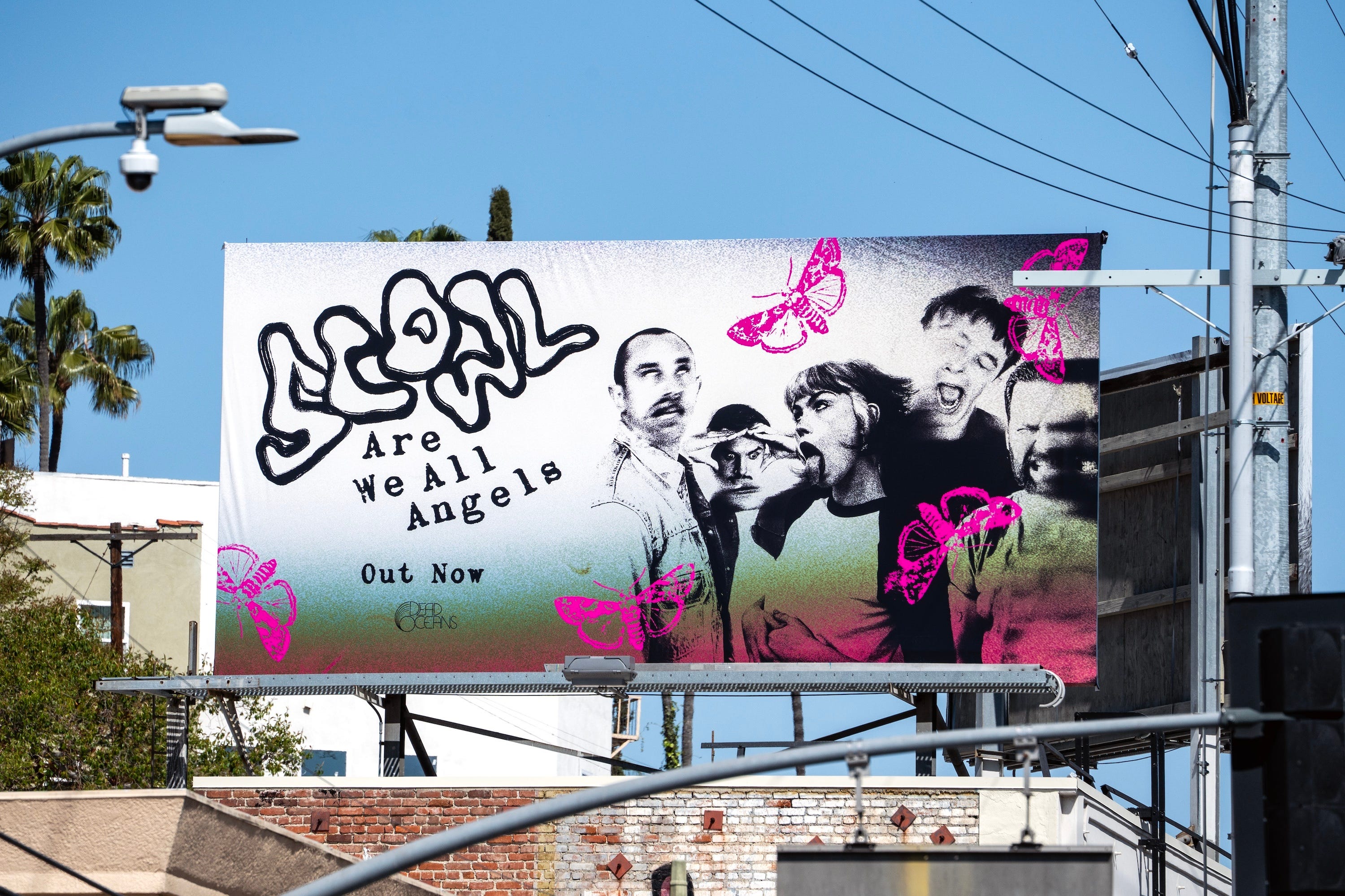
Here are some other highlights from this project, including my first billboard that went up in LA! Along with a flyer I made for their release show, some handwritten logo variations that ended up on posters and merch, and photos of the artwork on Colbert and on the floor of the new Rough Trade store.


Truly a surreal experience and I feel so lucky to be part of an album campaign for such an incredible band and album. I love this album dearly, it’s a front to back banger.
MOVIES
Soooo many movies to talk about this month!
Brainscan ☆☆☆☆☆
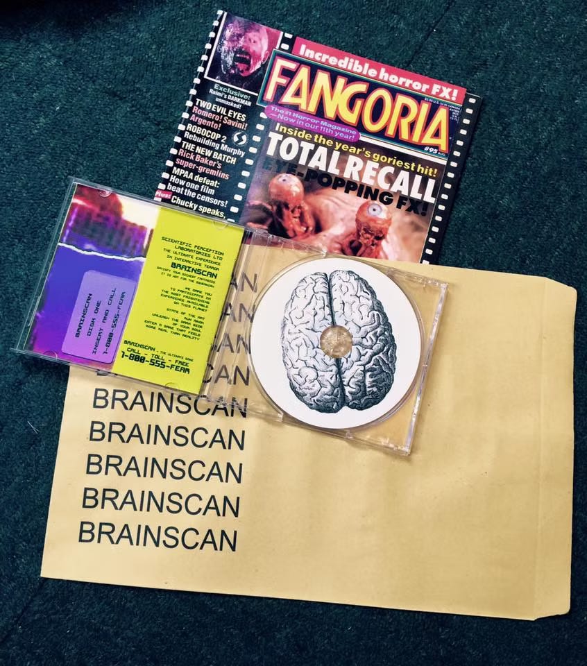
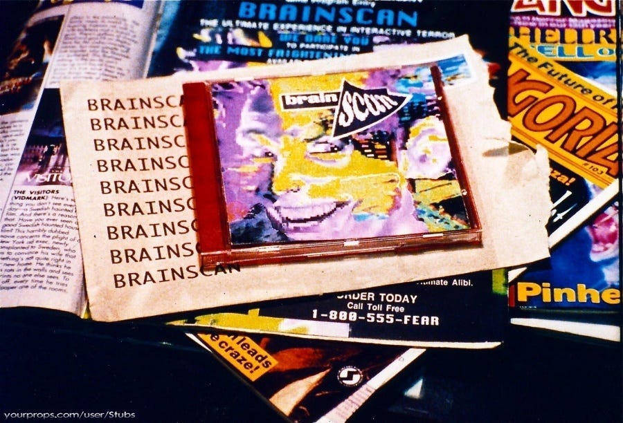
Coming in with a whopping 13% on Rotten Tomatoes and a solid 2-3 stars across the board, a new so-bad-it’s-good certified Julia classic. Made in 1994, this horror/sci-fi movie follows a horror and computer game obsessed kid named Michael (with the coolest room ever that I now covet) who finds out about a new immersive horror game he read about in an issue of Fangoria. After dialing 1-800-555-FEAR (no I haven’t tried yet), he’s sent a CD-ROM disc in the mail. After reluctantly starting it up, he’s immediately launched into a first person point of view game where he murders a stranger. After the game is over, maybe you guessed it, Michael finds out the lines between the game and reality are blurred. We then meet The Trickster who is basically just a punk knockoff of Beetlejuice, taunting Michael throughout this journey. Okay so it’s bad….. but it’s great pleaseeeee just lean into how corny and awful the acting is…. I found a horror fan online who studied stills of the game’s packaging from the movie and created a 1:1 replica of the Brainscan CD and packaging. I really admire the dedication and wanted to share it, because it’s impressive but also the design is sooo cool and 90s.
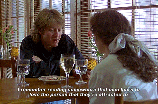
Sex, Lies and Videotape ☆☆☆☆☆
Finally picked up a used copy of this from Night Owl Video in Brooklyn, and loved loved loved this movie! I think it’s honest and perfectly written, exploring intricate conversations and theories about sex, gender, and interpersonal relationships. James Spader and Andie MacDowell’s characters have such great chemistry.
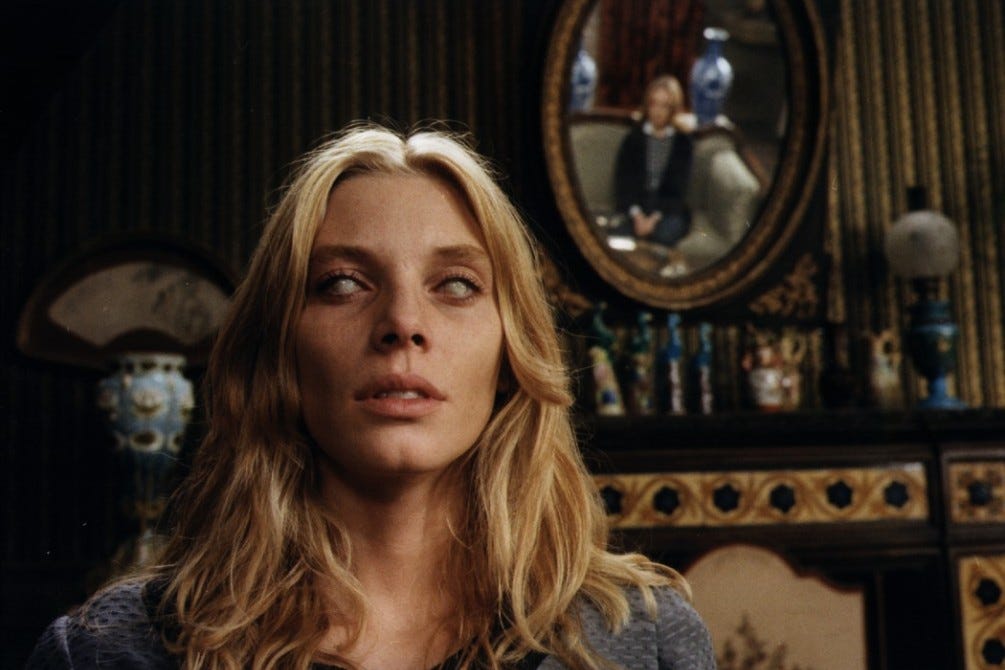
The Beyond ☆☆☆☆☆
The Beyond, not to be confused with Stuart Gordon’s masterpiece From Beyond (although maybe equally as gross), is the first Lucio Fulci movie from my watchlist that I watched this month. I didn’t know what to expect, but I love Italian horror and Giallos, and went in knowing Fulci is a cult favorite. The Beyond is about a woman who inherits an old hotel in rural Louisiana where a horrific murder once took place, and we learn the hotel sits on a gateway into Hell. It’s the second film in Fulci’s trilogy The Gates of Hell, which are now also on my watchlist since I didn’t realize there was a trilogy.. I knew this would be a supernatural, zombie-esque horror but didn’t expect the level of special effects and disgust that it actually delivered. That spider scene was brutal, be warned.
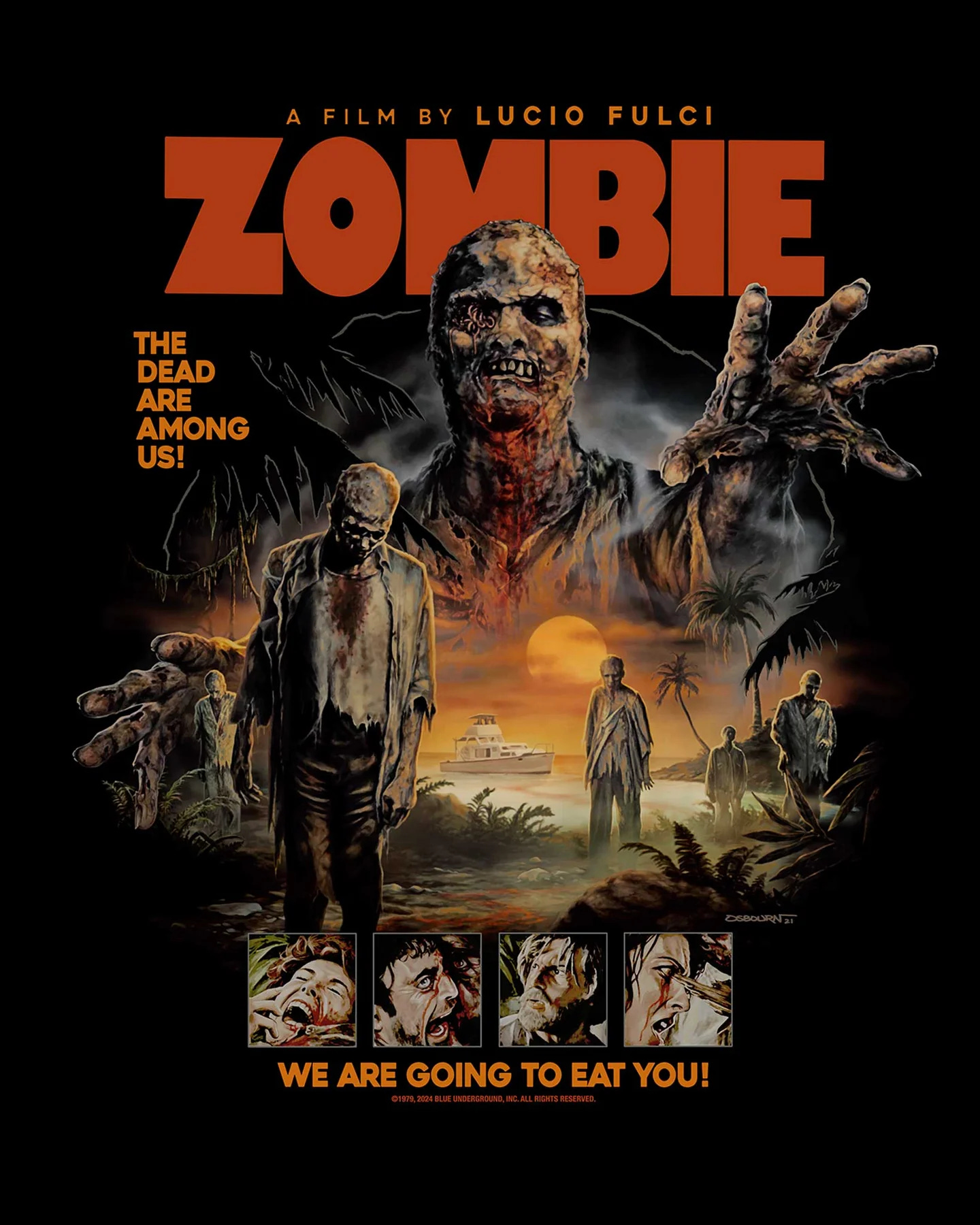
Zombi 2 (or Zombie Flesh Eaters) ☆☆☆
I tried so hard to find an appropriate gif but I don’t want to scare everybody with the imagery because some of you aren’t here for all that lol…. anyway another Fulci, probably one of his most well known. The plot basically follows a doctor trying to control cannibal zombies on the Caribbean island of Matul, where a reporter and woman name Anne show up looking for her missing father but eventually find themselves being attacked by zombies. There’s a pretty incredible opening scene involving zombies on a boat in NYC and it’s sick, also *SPOILER* there is a great scene at the end where we end up back in NYC and we see an awesome shot of zombies walking on the Brooklyn Bridge, invading the city.
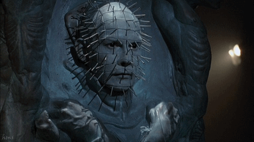
Hellraiser III: Hell on Earth ☆☆☆☆
Back again to talk about horror’s greatest character design. Finally threw on Hellraiser 3 from my boxset, and was not disappointed. Pinhead and co. are now in NYC, living above a club called Boiler Room (yep), imprisoned in a statue and eventually resurrected to wreak more havoc. There is a scene towards the end where Pinhead is in a church and it rocks, I will not spoil it for you in case you want to watch it…
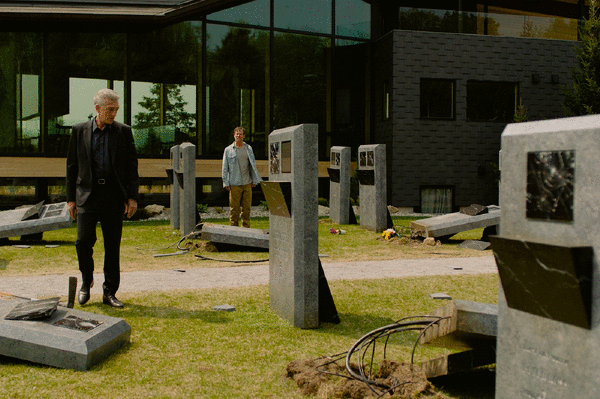
The Shrouds ☆☆☆
Went to see the new Cronenberg at Lincoln Center, followed by a Q&A with David. I’m not sure… I think I’ll need to watch this again and read about it some more but it’s not fully clicking for me. I liked the ideas Cronenberg is exploring here but parts of the film felt detached and cold for me, lots of what seemed like product placement throughout, which you could argue is intentional in some way to the character but wasn’t working in my opinion. This happens a lot for me with Cronenberg, I really love some of his work and don’t care at all for parts of it. I need to have a think on it and revisit it, but it was helpful to hear that this one is inspired by the loss of his wife and the profound grief that follows him. I followed this up shortly after with his short film The Nest, which for the sake of not putting gross imagery in your head I’ll let you google. But it gave some clarity to some of the themes he explores in the Shrouds and overall I just thought it was a successfully disturbing short if you’re into psychological horror.
A few others from Letterboxd:
The Prestige ☆☆☆☆
(invented plot twists)
Confessions of a Teenage Drama Queen (Rewatch) ☆☆☆☆☆
(classic maybe best movie ever made just saying)
The Suckling ☆☆
(amazing creature design, boring af movie)
Re-Animator (Rewatch) ☆☆☆☆☆
(Dennis Paoli intro, sooo epic)
Halloween: Resurrection ☆☆
(Michael Myers vs. the internet)
MUSIC
Albums I listened to this month:
Piggy Wings — The Yummy Fur
Conditions III — Chalk
60 Second Wipe Out — Atari Teenage Riot
Other Music — Dolly Mixture
But Wait There’s More — The Pearly Gatecrashers
The Fawn — The Sea and Cake
INSPO
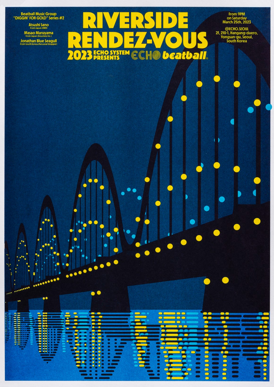
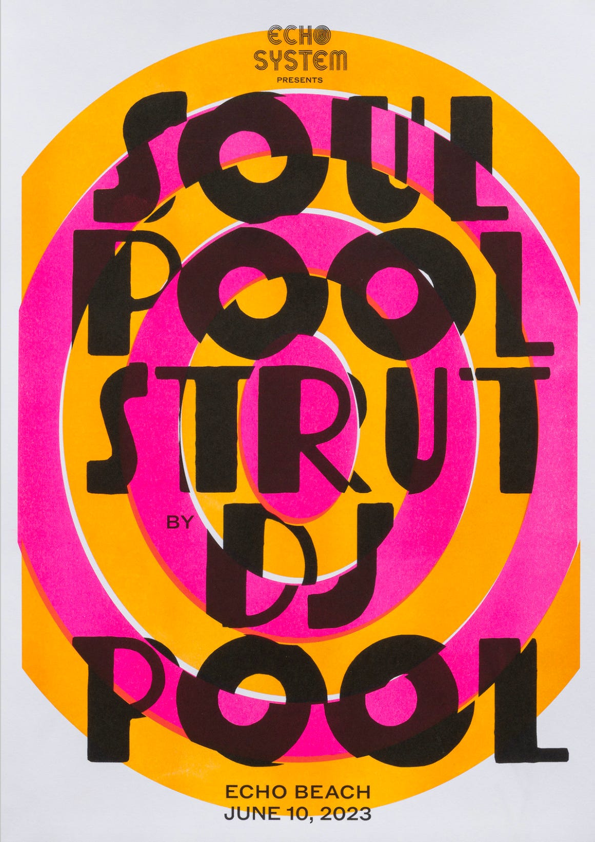
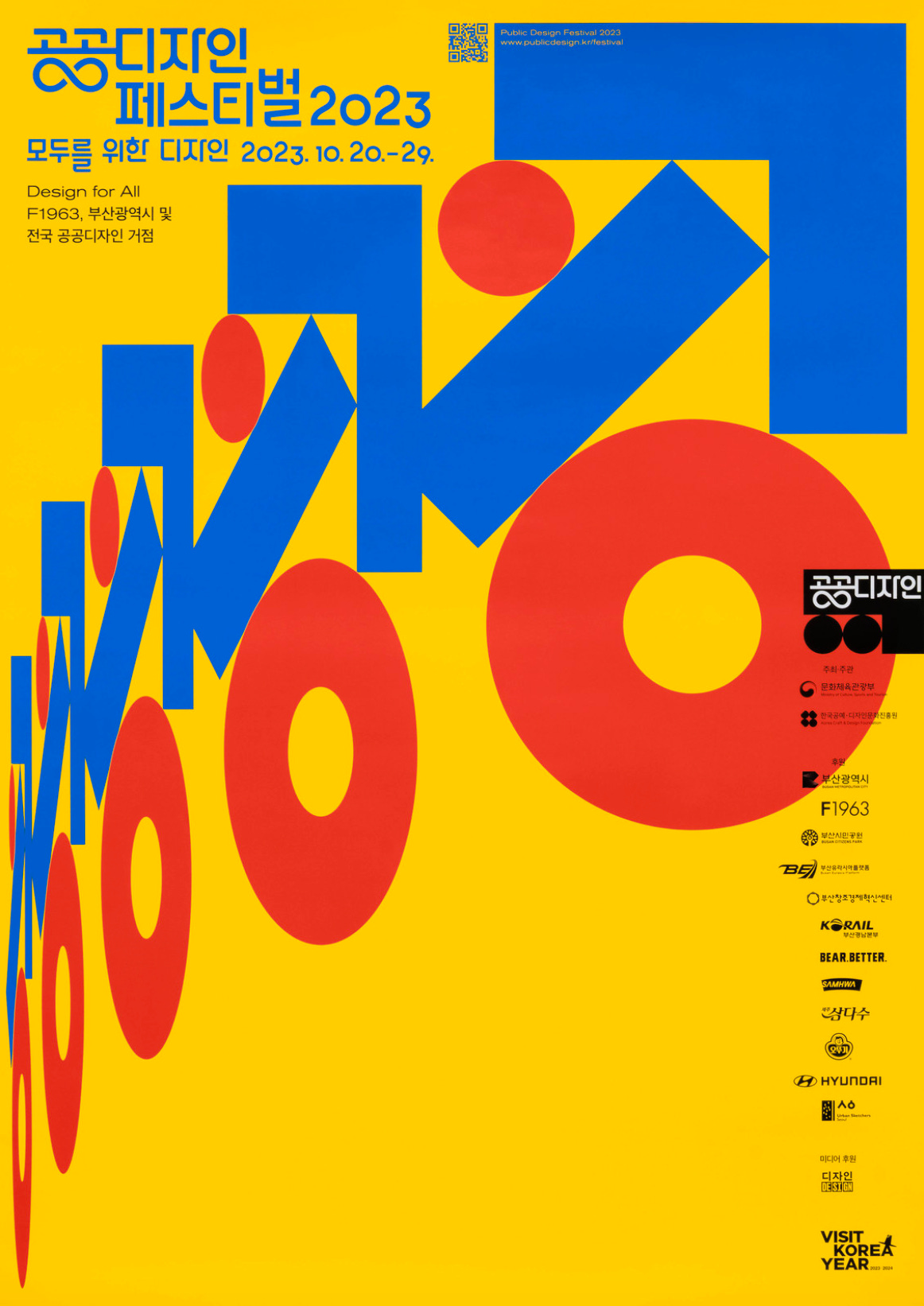
I’ve been taking a look at the Typographic Posters archive, which has a ton of type and layout inspiration. I really love these posters by artist Jaemin Lee, here are a few!
That’s all for now, thank you for reading as always!
thank you so much for sharing the in-depth process of this amazing album art, it’s so inspiring and i loved reading it!! all the handmade parts really give it so much character, congrats on the great work 💗‼️
Wow but really - I remember seeing a made-for-TV version of Brainscan... when, I don't know? And it was nigh unwatchable with commercials because of how weird it was. I would have never known what it was called but the description is unmistakable. Yep. With the foot? And the dog?