


Computer Love #003
Monthly archives exploration of 80s-90s computer ads.

Hi everyone and welcome back to Computer Love! In case you missed it, I started a monthly (or perhaps bi-monthly) newsletter in addition to my usual one, covering archival material from vintage computer magazines. It’s been a minute I know… May was a busy month. I’ve been collecting bits and pieces to share with you, let’s go through them.
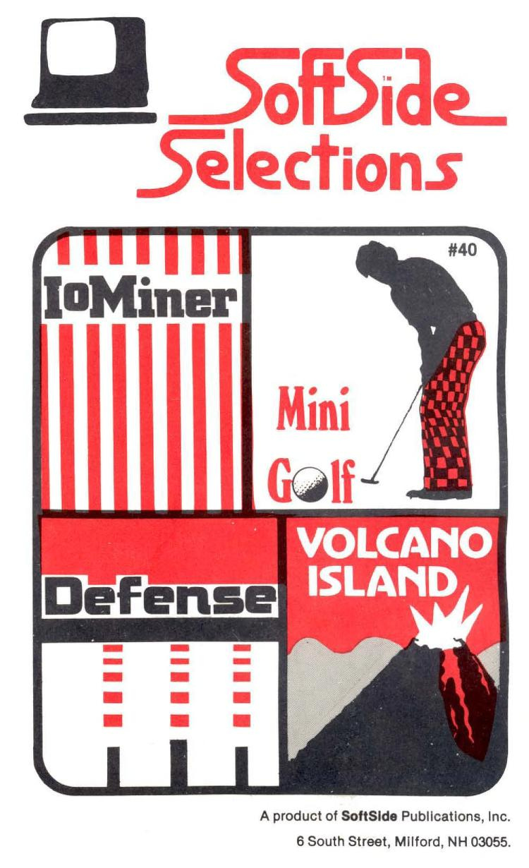
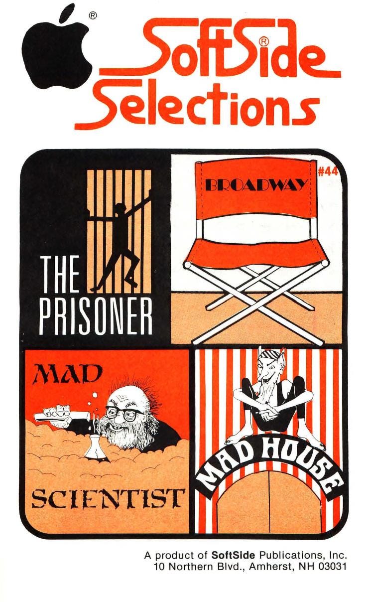
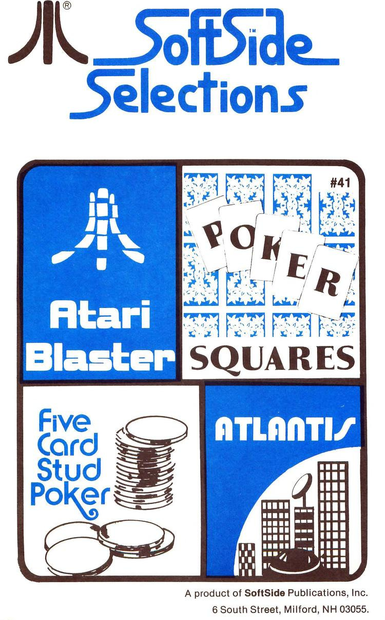
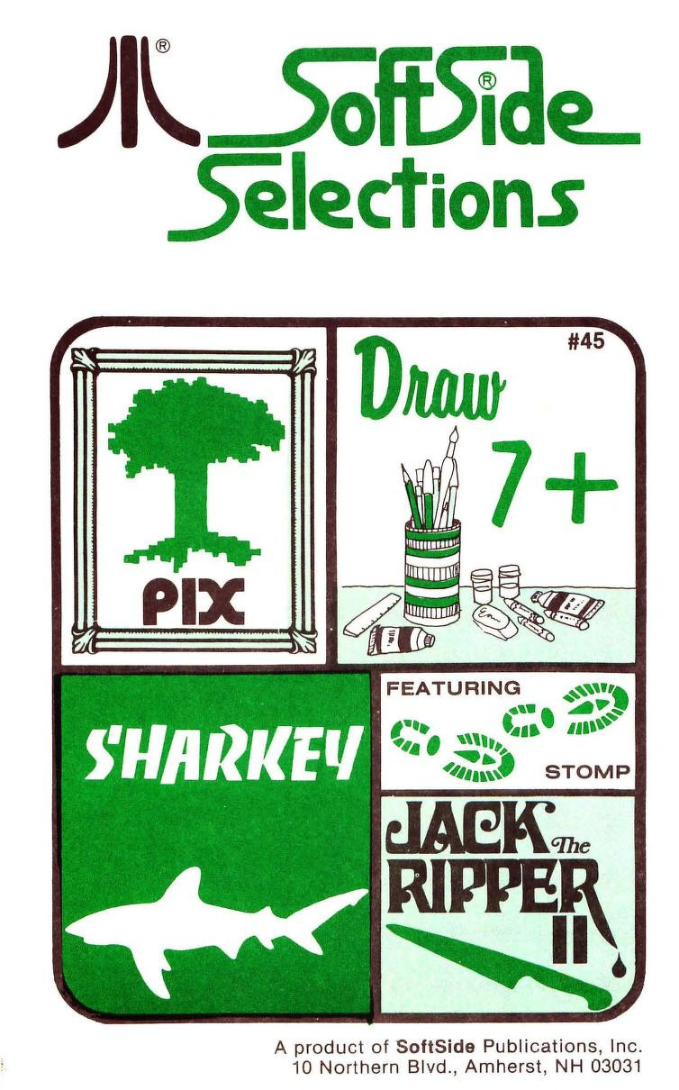
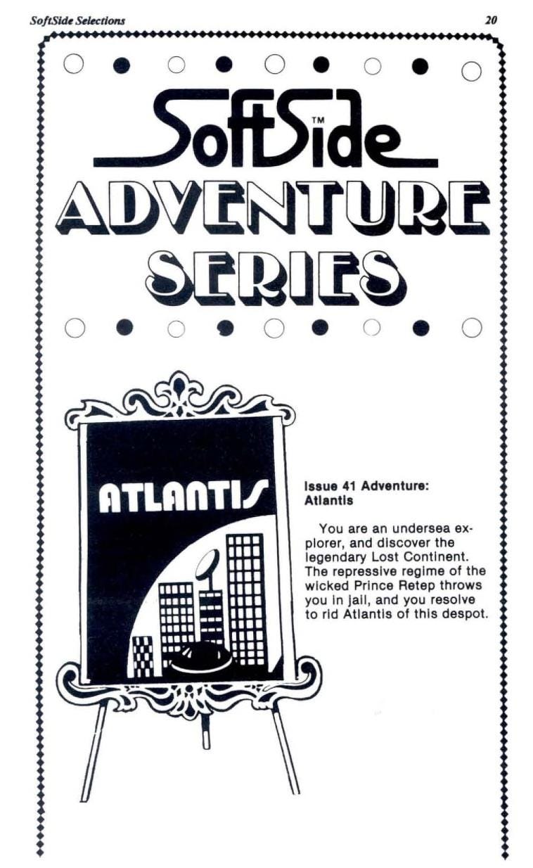
I’ve been digging through issues of the 1978-1984 computer magazine SoftSide, published by SoftSide Publications in New Hampshire. SoftSide was a personal computer programming magazine that covered programs from Apple II to IBM-PC and Atari 8-Bit computers.
Some of the covers often were a grid of four images of the categories covered in the publication, printed in black and white with one standout color chosen for each publication. The way they were designed and printed allows for some great xerox patterns and color ink bleeds. Love the imagery and typography on these.
A peak inside some of these publications. Some of the graphics are cool, but I think the covers are cooler.

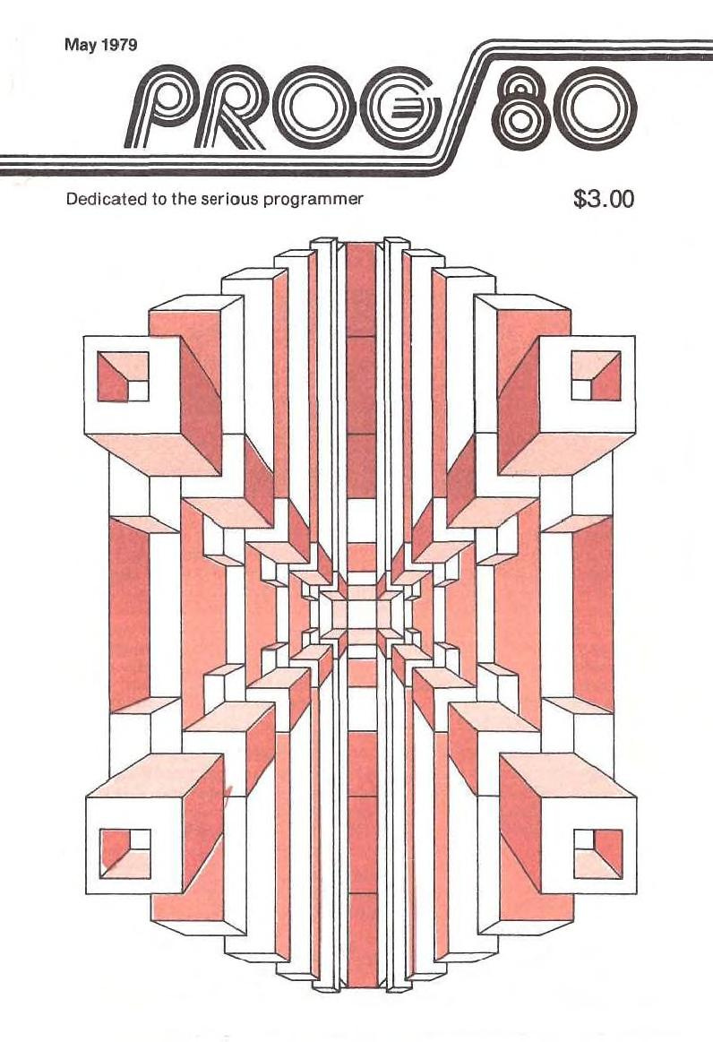
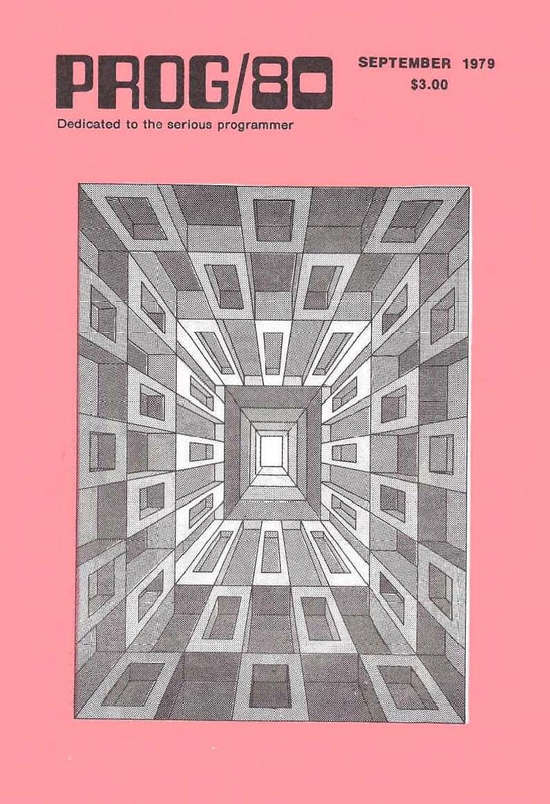
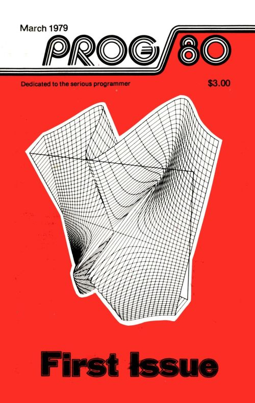
Prog80, a newsletter dedicated to programming, was published by SoftSide in the late 70s and early 80s. Here are some of my favorite covers, the symmetrical geometric drawings and textures are super cool.
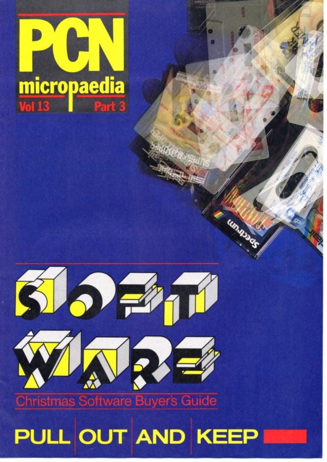
More incredible covers for software guides and computer magazines. The type on this Personal Computer News cover insanely cool, I think I have that typeface in a Dover book somewhere that I’ll need to scan to use.
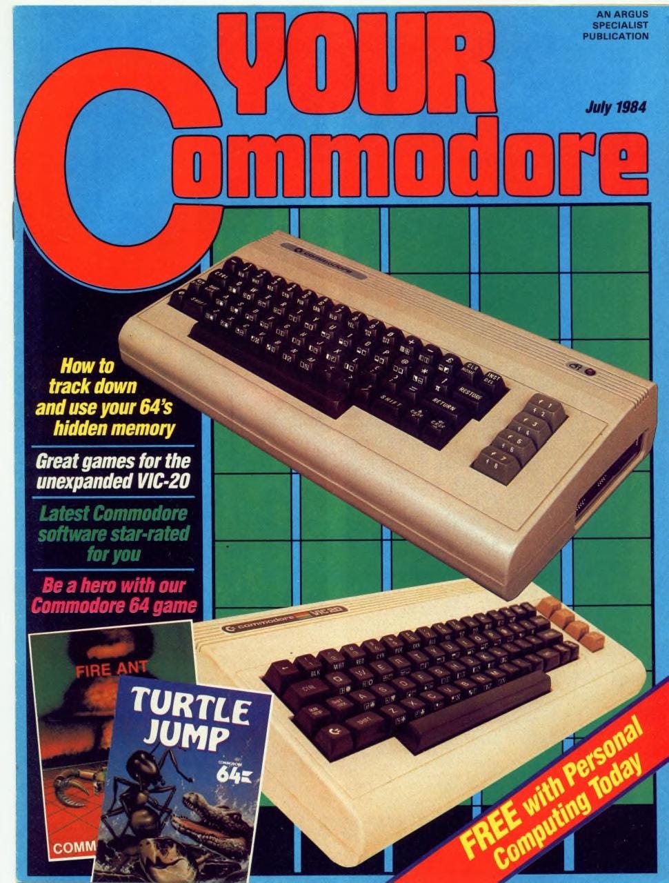
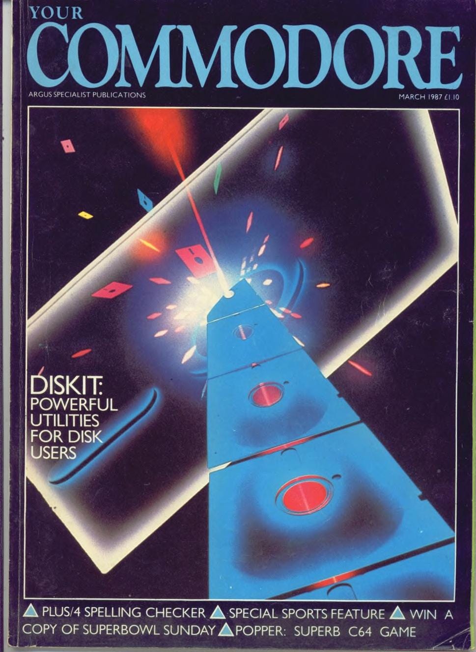
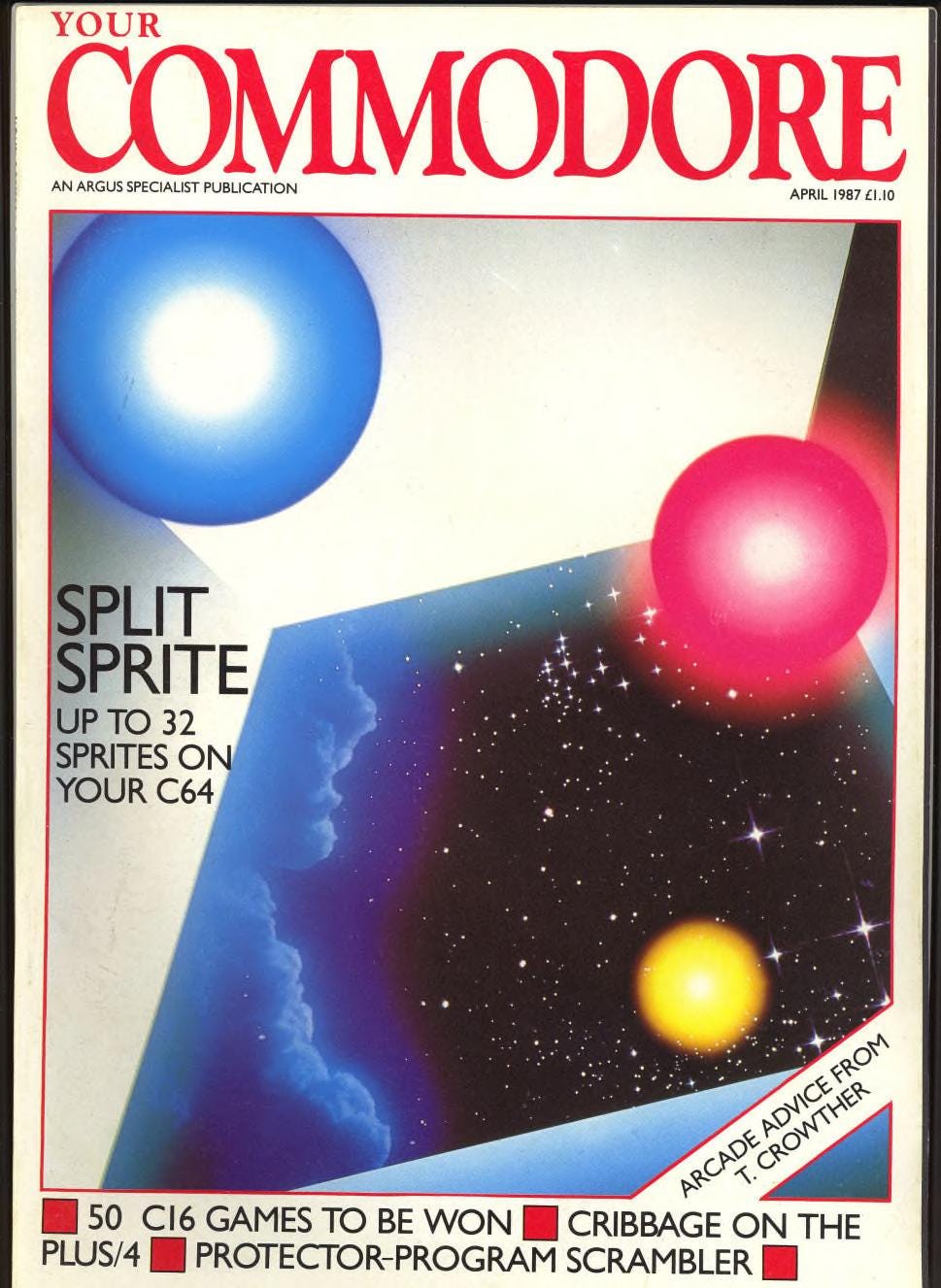
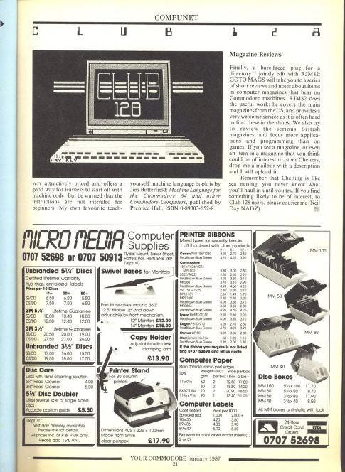
Your Commodore magazine (1984-1991) was a magazine for the Commodore range of computers, including the Commodore 64, Amiga, and Commodore PC range.
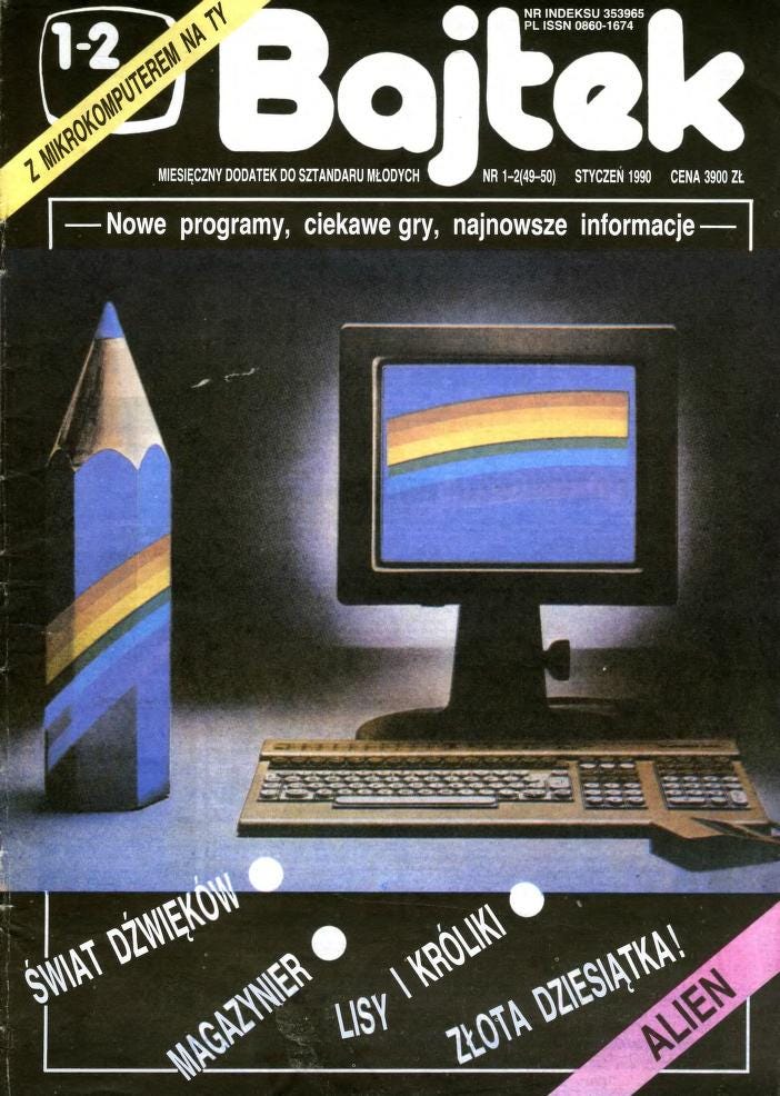
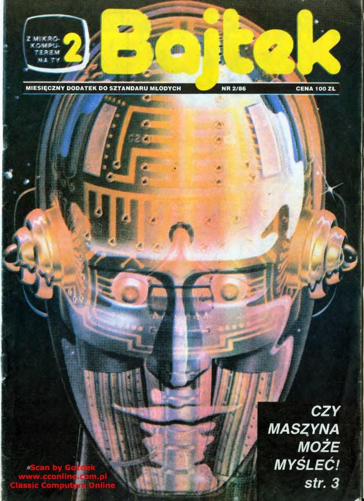
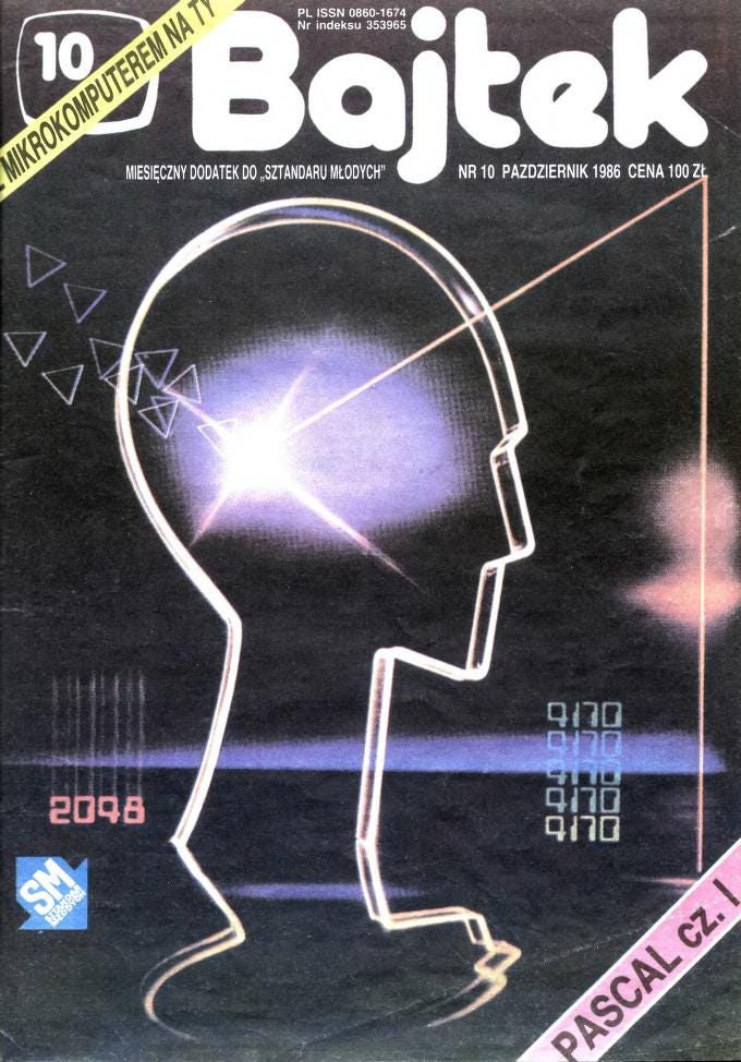
Bajtek Magazine (1985-1996) was a Polish magazine covering computer science.

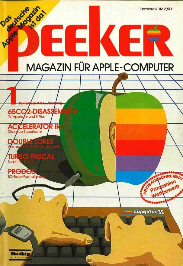
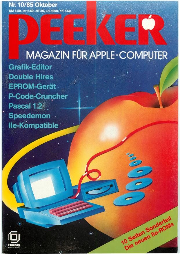
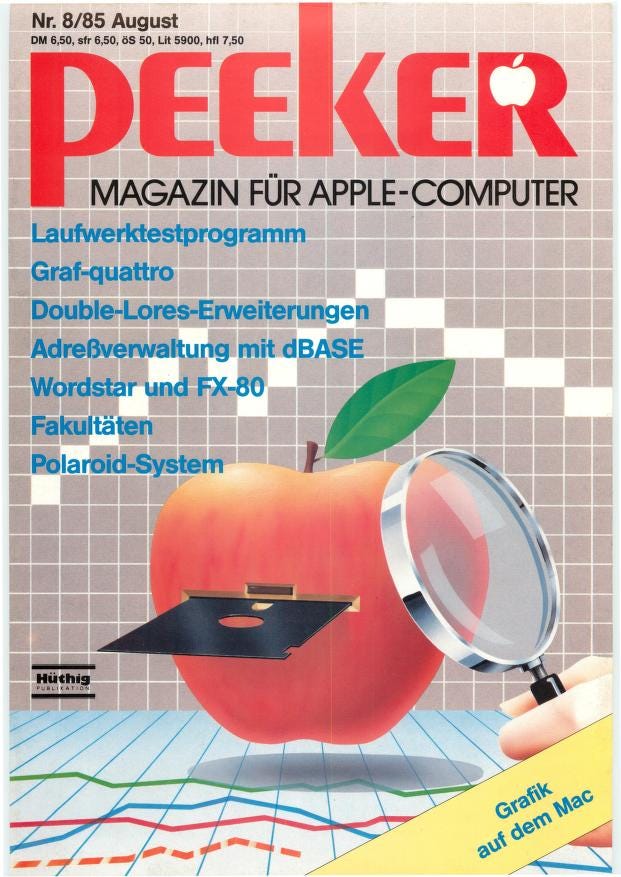
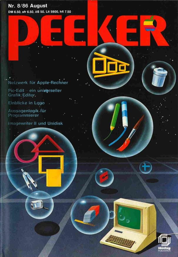
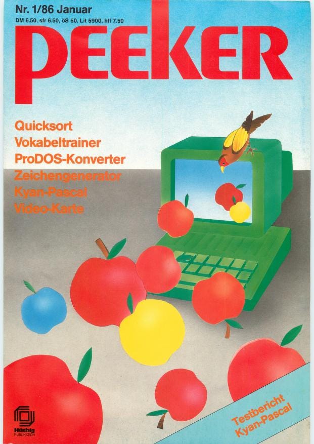
Came across these German-language Apple computer magazines Peeker that were published between 1984-1987, covering programs for the Apple II computer. The covers almost always have an illustration of an apple and/or a computer, floating through a grid of primary of colors and shapes.
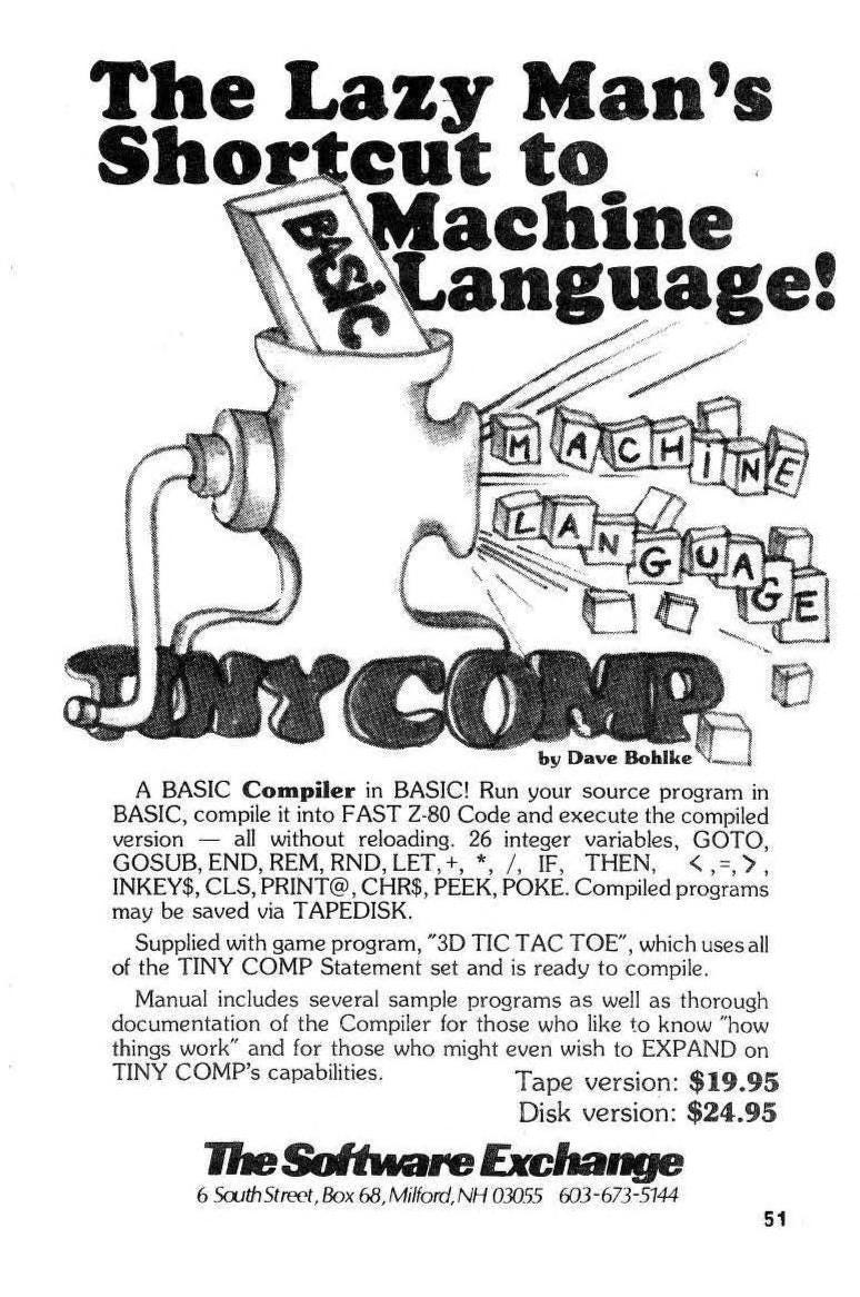
Miscellaneous ads I’ve screenshot that spoke to me either through illustration or typography. I’ll end up saving random ads and bits of magazines in order to reverse search which font is being used. I end up either finding the modern digitized version of the original font created in the 70s or 80s, learn that it was hand drawn, or even Letraset. I’ve definitely said it before, but the best way to create a design that mimics a specific era is to go directly to the source and use fonts that were in real ads and publications like these ones.


I was flipping through an Apple 2000 Magazine and came across this review of the “Fontographer”, which seems to be a way to design your own PostScript font on an Apple computer. PostScript fonts are a type of outline font developed by Adobe, and are known for retaining their clarity even at a smaller scale. As you can read below, these fonts are made of Bézier curves instead of bitmap or a rasterized image. I’ve personally never designed a font (although I’d like to!), but knowing I could’ve easily made an outline font on this computer makes me want to hunt down this program and try it myself.

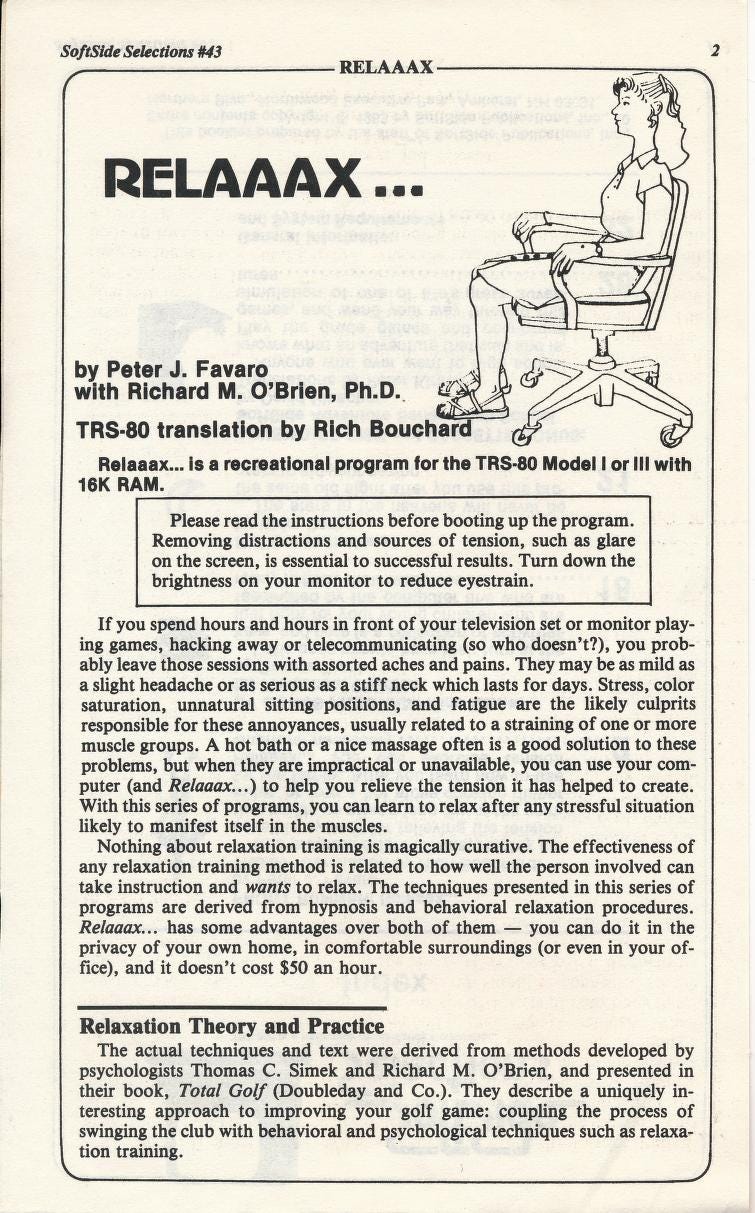
I think that’s all for now! Remember to take breaks from your computer and relaaax. Here’s a page in SoftSide that’ll tell you how!
In cr eeeeeeeeed
the type on the pcn cover is crazyyy