


May '24
Monthly design roundup for May 2024.

Hello! Welcome back to my silly emails, I’ve got stuff to share with you.
DESIGN
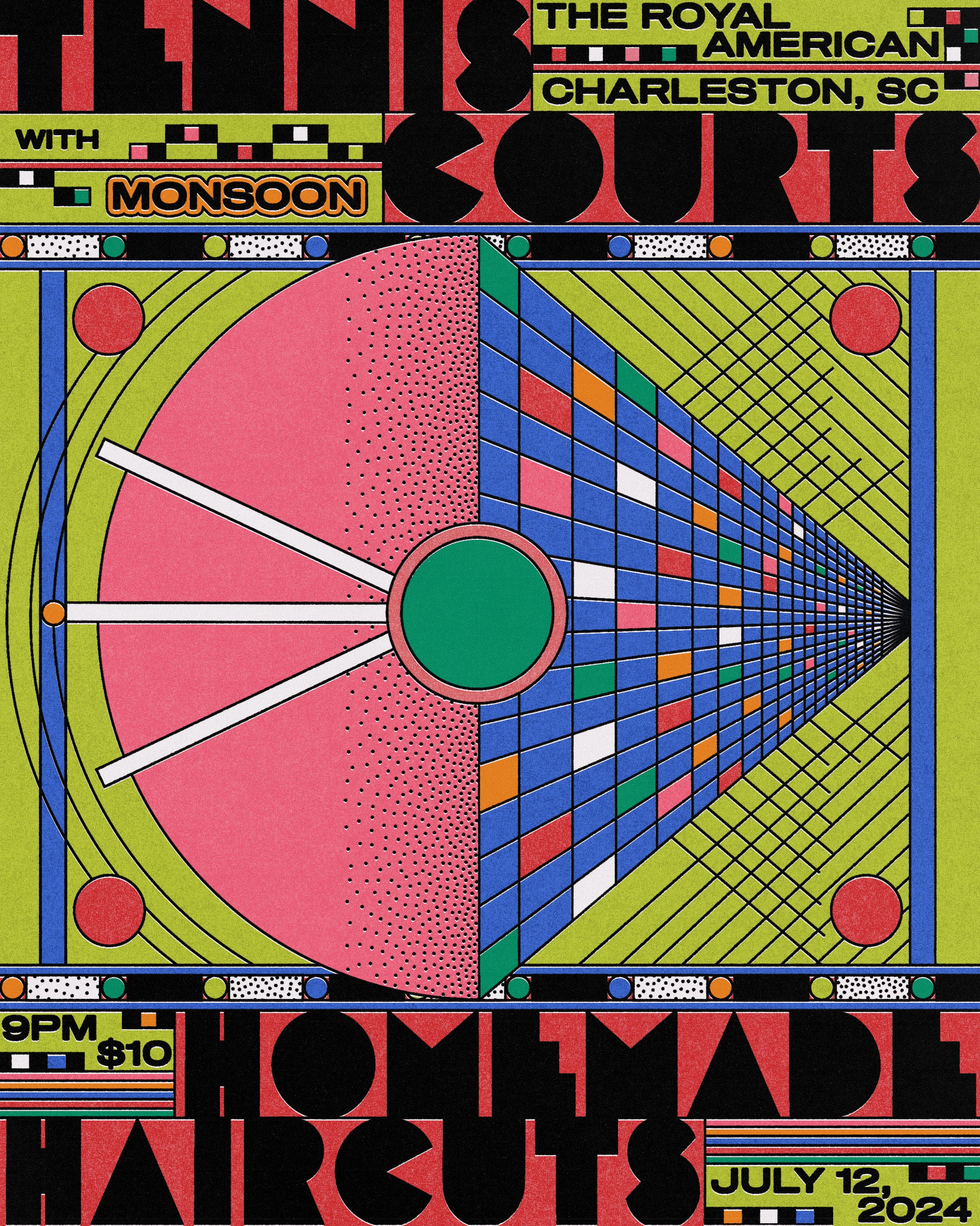
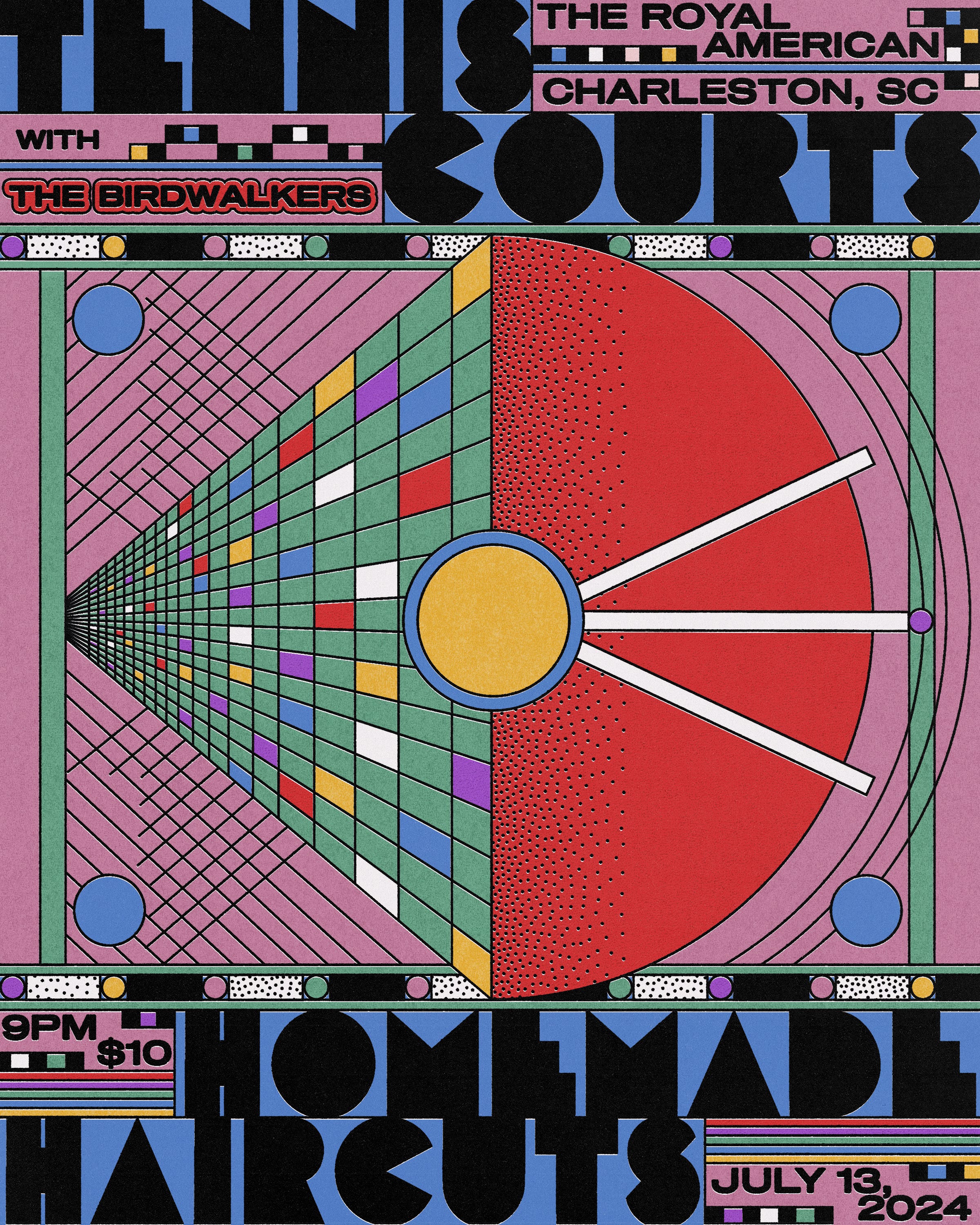
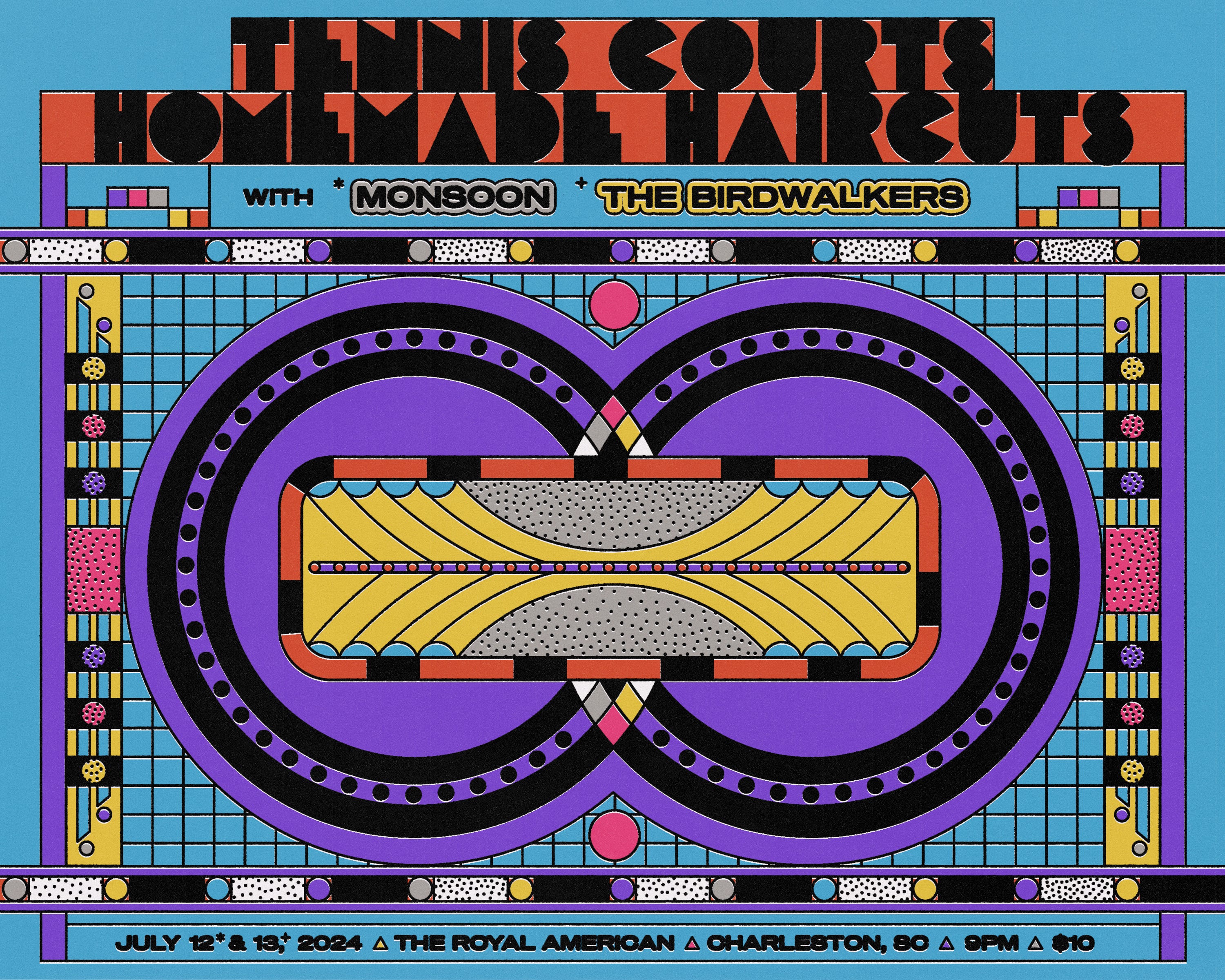
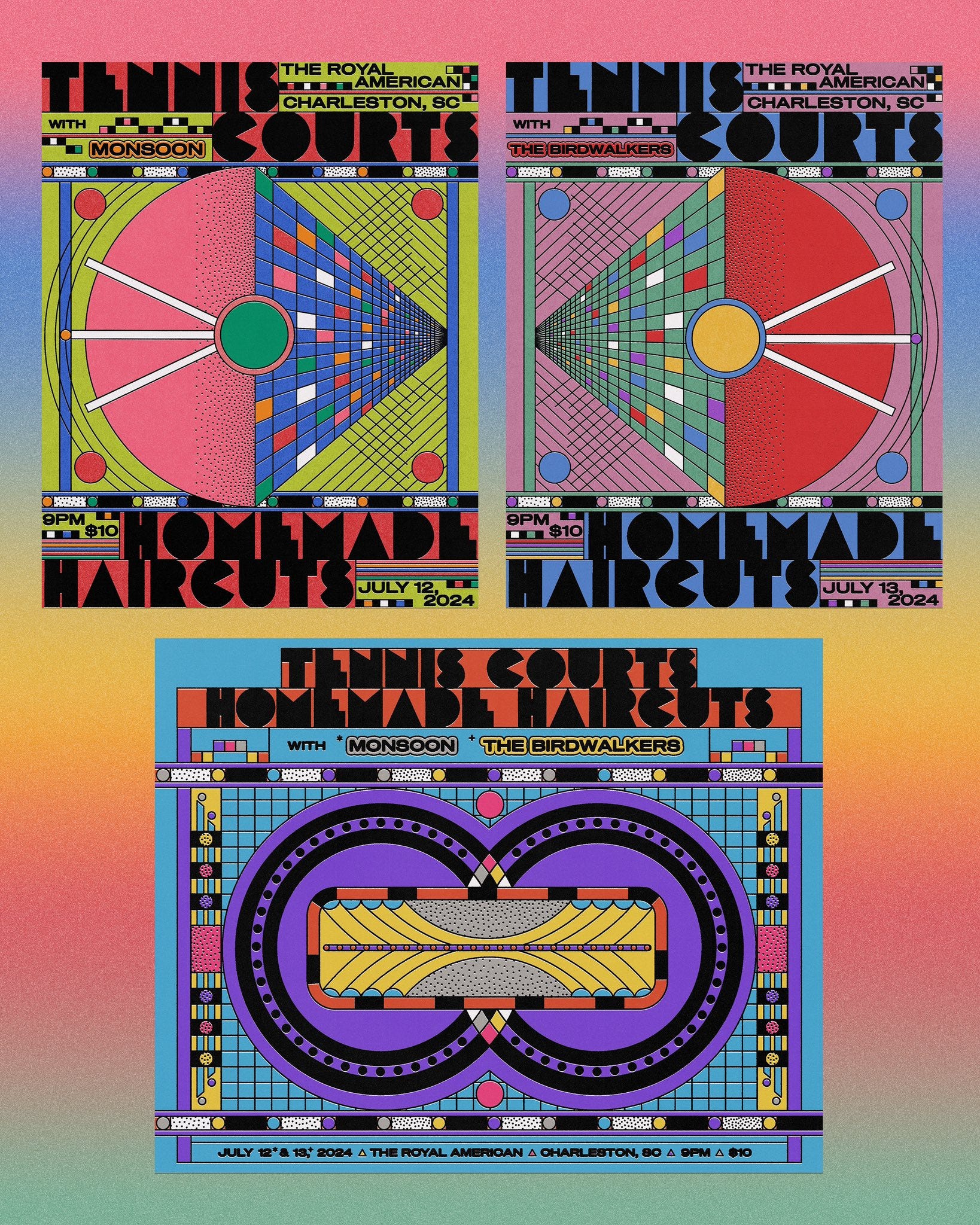
A triptych of posters for my friends in Tennis Courts and Homemade Haircuts! It’s always a pleasure to make work for them because they just let me do my thing and make as many shapes as I want. Here are the two individual show posters below and a poster with both dates.
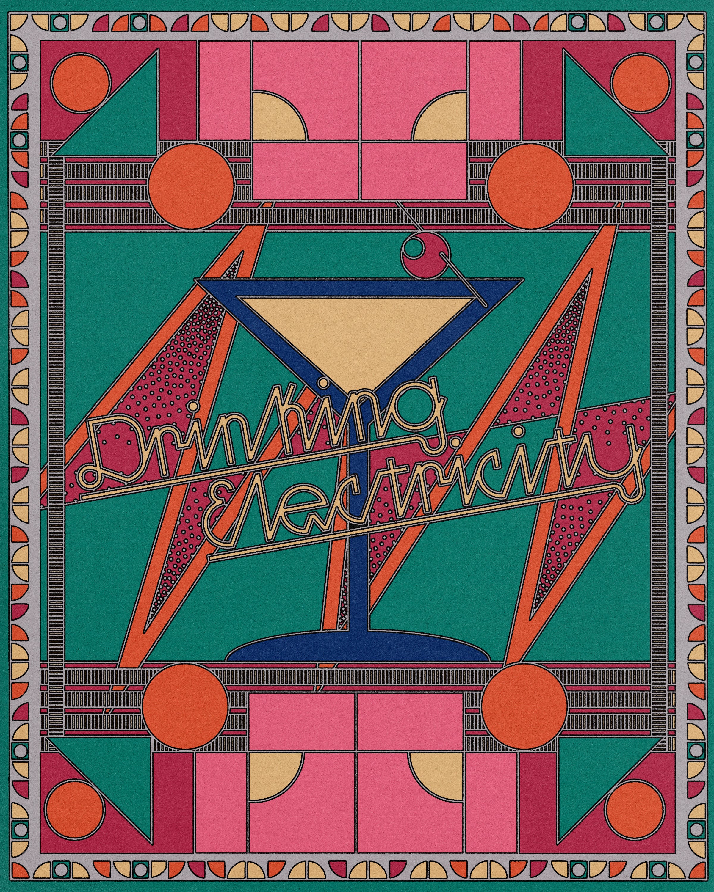
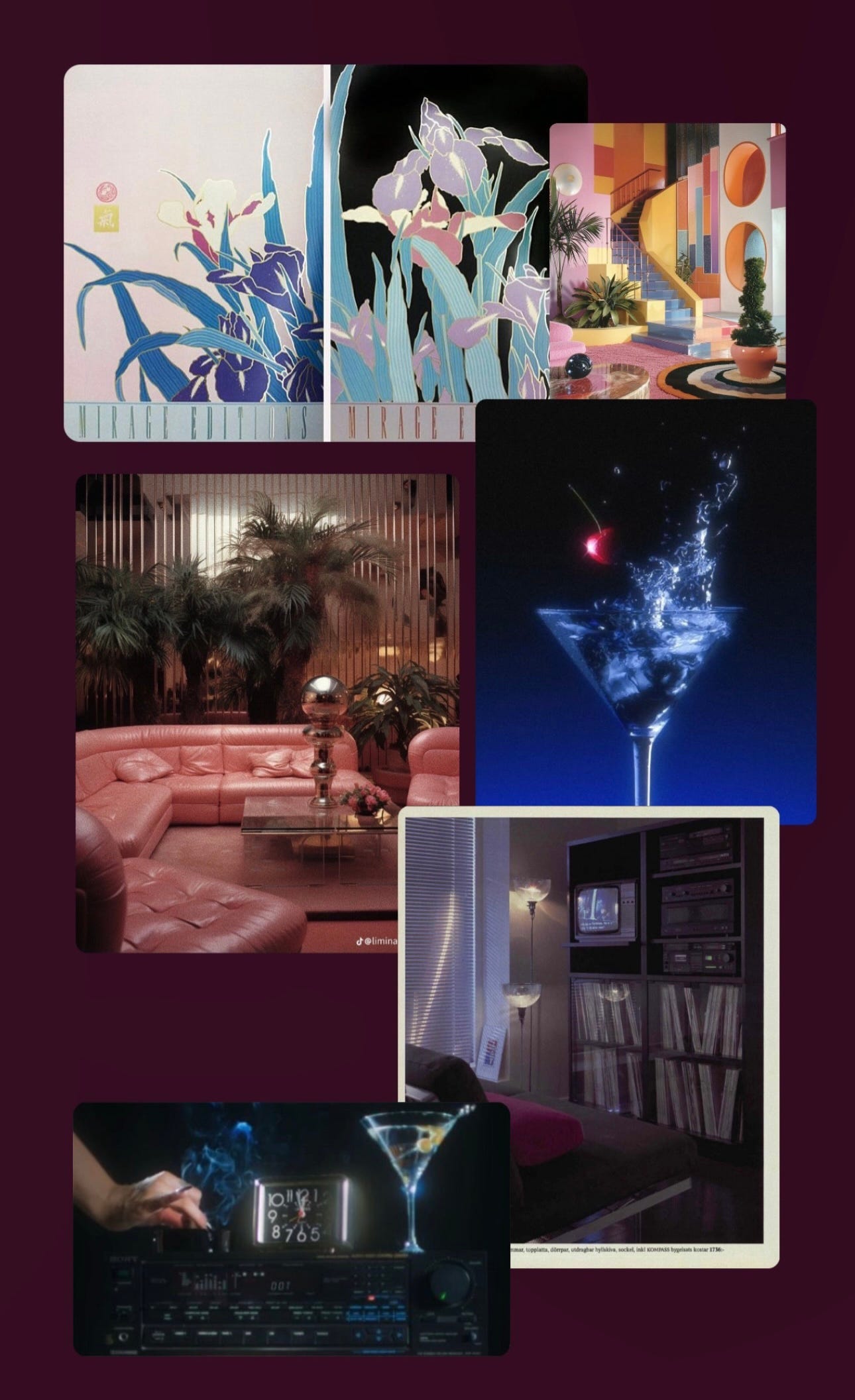
I’ve been in a bit of a creative rut, so I spent some time making a poster for fun based on the band Drinking Electricity from the 80s. See below for some inspo I collected for this before I started designing!
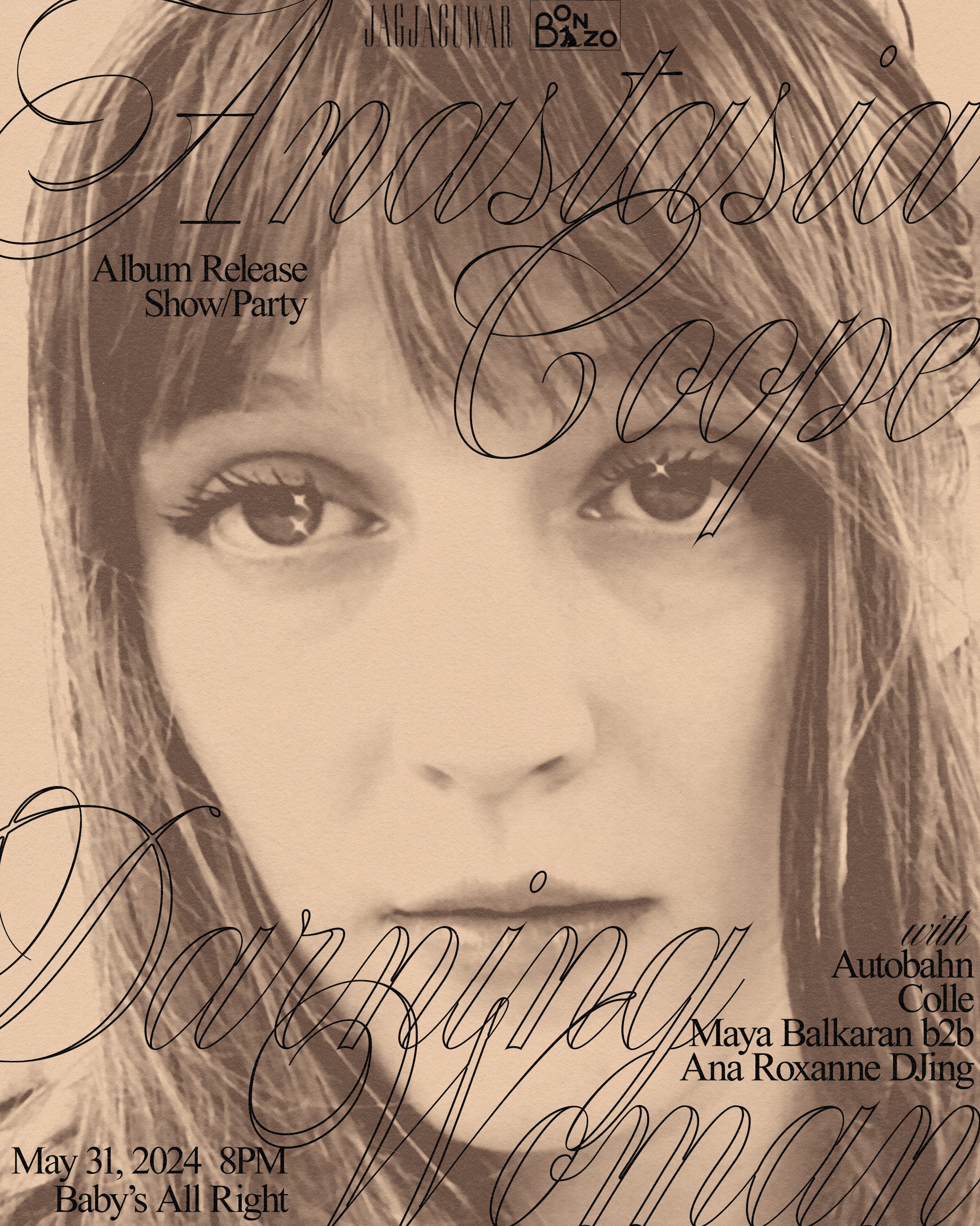
I’m also finally sharing (here first, IG second) the art direction and design I did for Anastasia Coope’s debut album ‘Darning Woman’ which comes out this Friday, May 31st via Jagjaguwar. This was the first record at my label that I did full art direction for, and it’s been challenging but rewarding to step out of my comfort zone and work directly with the artist to create something outside of my typical style. The packaging turned out really nice — fully matte finish with a hot pink spine and inner flood, so when you peak inside the record jacket you see a splash of color. There’s also a bright green paper lyric insert, and small business card with album & design credits.
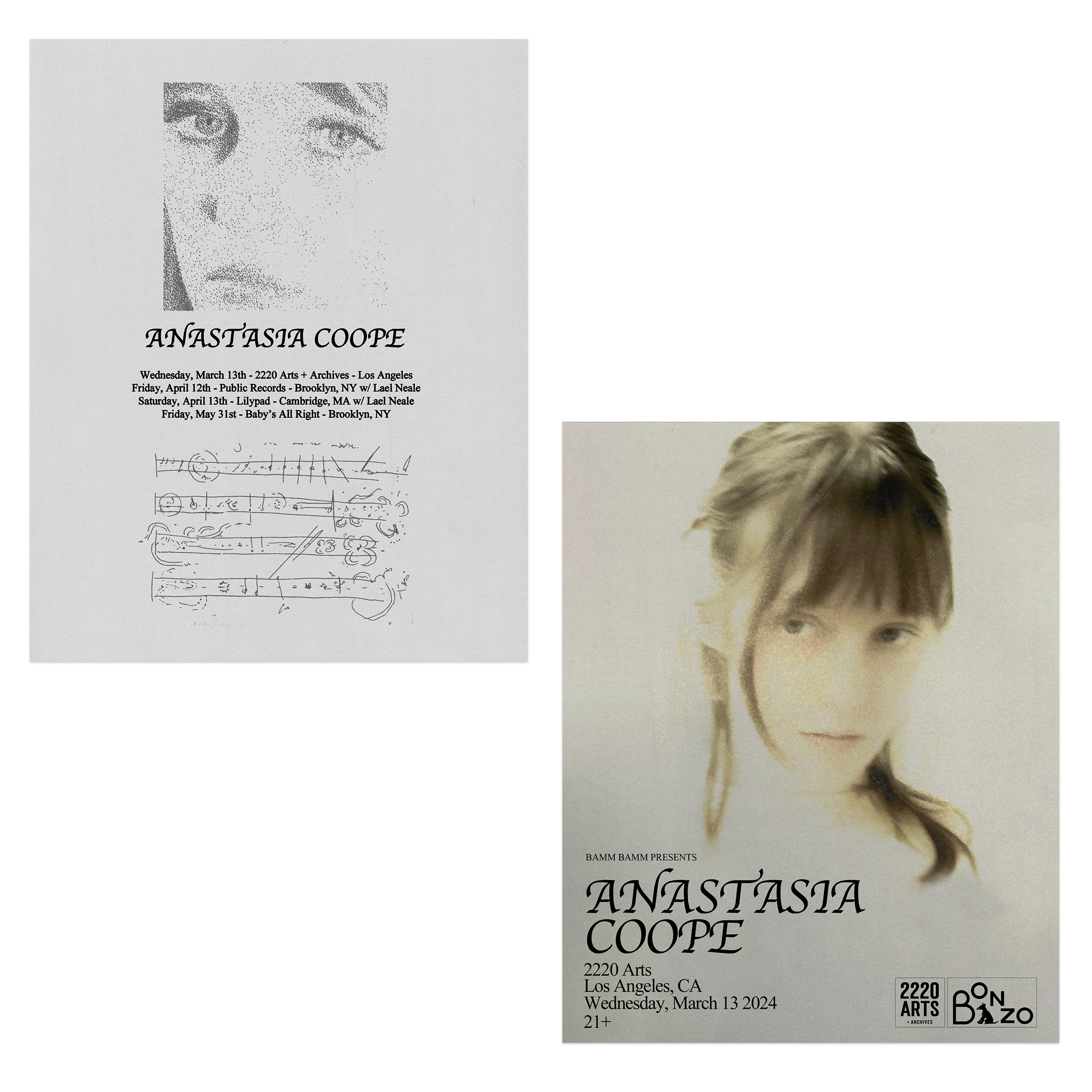
Below are the LP, CD, and various show posters I’ve made over the past several months.


MOVIES
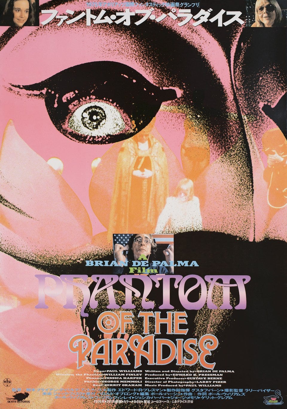
Phantom of the Paradise ☆☆☆☆☆
Genuinely don’t know how I managed to never hear about this movie but I had a first time viewing experience of this a few days ago and can’t stop thinking about it. The soundtrack, the set design, the costumes, the design, the colors…. Jessica Harper’s first role!! And as a huge Suspiria head I had no idea this was her first role, so it’s beyond cool to see her as someone who isn’t Suzy. Couldn’t find a GIF so enjoy this cool Japanese poster I found. The parallels between this film and Rocky Horror are also undeniable, even came out the year before. Would make a perfect double feature. Shoutout to Campbell for showing me this movie if you’re reading this. Banger.
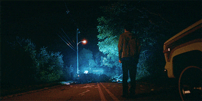
I Saw The TV Glow ☆☆☆☆
The rumors are true I saw this movie twice… I enjoyed it more the second time because I picked up on all the (obvious) themes that I kind of missed on my first viewing, but the second time around I grew to understand it better and connect all the dots. Aside from the deeply moving portrayal of gender identity and coming of age, Jane Schoenbrun is a master at diving into early internet nostalgia and what it’s like to become completely absorbed by your favorite media while growing up.
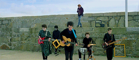
Sing Street ☆☆☆☆
This is a rewatch, I’ve actually seen this movie a few times… my first viewing was when it came out in 2016 and of course my viewing experience has changed now that I’m older, it’s absolutely kind of corny/bad/definitely a little misogynistic (the main female lead is just not a real person lol). All that being said, I love coming of age movies set in the 80s, and especially revolving around 80s music. You can hear Conor’s influences throughout the band’s ever-changing sound— channeling The Cure, Duran Duran, Hall & Oates, and more. So much of music is derivative and our influences bleed through in everything we make! Makes for a fun, dynamic soundtrack.
Other watches on Letterboxd:
To Die For ☆☆☆☆
The Vanishing ☆☆☆☆
Anyone But You ☆☆☆
Punch Drunk Love ☆☆☆
Miracle Mile ☆☆☆
MUSIC
Albums I’ve had on repeat:
Hex Dealer — Lip Critic
Challengers [MIXED] by Boys Noize — Trent Reznor and Atticus Ross
Mondo Tempo — Freak Heat Waves
Evergreen — Echo & The Bunnymen
Clear — Cybotron
Twenty Covers of Madonna — Italians Do It Better (Various Artists)
Britpop — A.G. Cook
INSPO
So much inspiration to share this month, starting out with KangHee Kim’s photography. I remember seeing KangHee’s work as an undergrad in one of my photo classes (MICA to be exact, also her alma mater!), and instantly bookmarking it in my brain as lifelong inspo that forever changed the way I see surrealism and street photography. I lost her website and her name for years, and it wasn’t until recently I got so desperate trying to find her again I searched “dreamcore photography” on Pinterest and immediately recognized the first image I saw.
These liminal spaces feel familiar, dreamlike, comforting and nostalgic yet foreign and strange for reasons you can’t explain. KangHee has manufactured these stills with digital manipulation and photo collage, but they also somehow feel like a real place you might have walked by in your dreams years ago. Here’s a grid of photographs from her longest running project, ‘Street Errands’.


Another source of inspiration I wanted to share this month is Tirazain, a digital archive preserving and documenting Palestinian embroidery. This was sent to me by a follower of mine because they thought I’d appreciate the intricate patterns and shapes, so thank you so much for sharing this with me! There are so many beautiful designs you can view here, some of my favorites are below.

Qamar / Moon (2)
قمر

Al Qaws, Arbaa Naamy / The Arch, Quadrants | القوس، أرباع نعامي

Qaws / Arch (1) | قوس
Sharing one last art piece from Sister Corita Kent before I go:
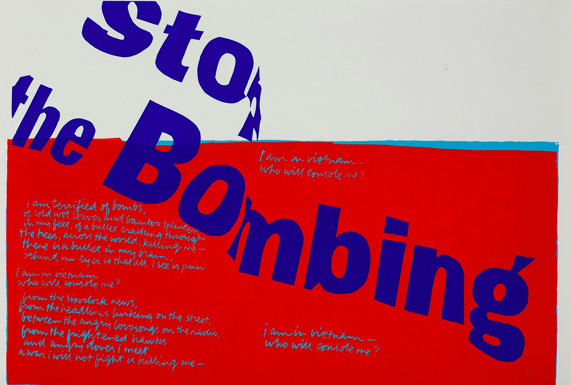
“Peace will not be made for us by others
It will not be given to us by others.
We must make it ourselves, and it is very hard work and very dirty work.
If we make it well, we are artists.
If we don’t, it means the end.
What else matters then - except to be artists?”
- Corita Kent, excerpt from “Speakout Against Nuclear War”, June 25, 1982
Thanks for reading!
your designs always fill me up with so much inspiration!!! 🩷🩷🩷